
Why “Paper Is Dead” Is a Distorted Perception
The most frequent objection we hear from entrepreneurs is categorical: “Paper is dead, everything must go digital.” This is a distorted perception, fueled by years of investments in ineffective graphic materials. The truth is that, in 2025, digital overcrowding has made physical channels extraordinarily more performant — as long as you know how to design them.
The data speaks clearly. While average attention on a social ad is measured in milliseconds, industry statistics on Direct Mail show that paper opening rates reach 91%. This contrasts sharply with email inbox saturation, where messages are ignored or deleted without even being opened.
But it’s not just about visibility — it’s about authority. According to classic MarketingSherpa data on advertising channel perception, trust in paper stands at 76%. This medium is perceived as much more authoritative than digital banners or pop-ups.
For Keryx Design, this data pairs perfectly with the concept of design as an “ambassador of the message”: a well-designed physical asset doesn’t scream for attention, but earns it through its intrinsic credibility.
The Bushori Case: One Scan Every Two Deliveries
The Bushori case is practical proof of this power: a trifold that registered a QR code scan every two deliveries. A 50% response rate achieved through the synergy between copywriter Daniel Porro and applied visual engineering.
The Science Behind the Result: Reducing Cognitive Effort
Why did one person in two choose to interact with the Bushori trifold? The answer lies in neuroscience.
Neuromarketing studies conducted by TrueImpact for Canada Post, measuring brain activity via EEG, demonstrated that paper requires 21% less cognitive effort to process compared to digital.

This is the scientific basis that Keryx uses to argue that design shouldn’t be “decorative” but should “reduce the reader’s effort.” If the brain struggles to decipher the message due to chaotic graphics or illegible fonts, it stops reading. If instead the design is “copy-safe” — meaning it protects the sales text — the message penetrates without barriers.
Creative Design vs. Direct Response Design
The enemy of conversion is traditional “creative graphics.” Many agencies focus on aesthetics as an end in itself, producing what we define as “visual noise.”
A purely aesthetic advertising brochure sabotages business because:
- It interrupts the reading flow with useless decorative elements
- It weakens the sales promise by making it hard to find
- It uses layouts that confuse the eye rather than guiding it to action
At Keryx we don’t make “art” — we build scientifically engineered assets to sell. Direct response design puts functionality and readability at the center of every visual choice.
The 4 Strategic Pillars of Keryx Design
To achieve 50% scan rate, we applied the four fundamental pillars of the Keryx method.
1. Extreme Readability
If it’s not read, it doesn’t sell. We optimized every space and visual hierarchy to ensure Daniel Porro‘s copy was processed automatically. Readability isn’t an opinion — it’s a technique to break down the client’s cognitive resistance.
2. Emotional Connection
Through clean and professional design, we built an immediate perception of authority. The client doesn’t feel like a “target” of a sale, but a recipient of valuable communication. This pillar transforms paper material into an authoritative voice of the brand.
3. Optical Path (Eye-Path Engineering)
We scientifically guided the reader’s eye. Through strategic positioning of titles, text blocks, and spaces, we created a visual track that leads the user directly from the title to the Call to Action (the QR code).
4. Visual Trojan Horse
We dressed the offer with an aesthetic that doesn’t scream “advertising” but communicates “useful information.” This approach allows bypassing the client’s mental filters. Once the material is in their hands, the visual structure allows the copy to penetrate their defenses and push them to action.
The Bushori brochure designed with the Keryx method

Hard Results and Social Proof
The numbers don’t lie. When design supports copy instead of sabotaging it, operational results become predictable.
Paola’s feedback confirms the success: one scan every two brochures delivered. A tangible result that transforms design into a conversion lever.
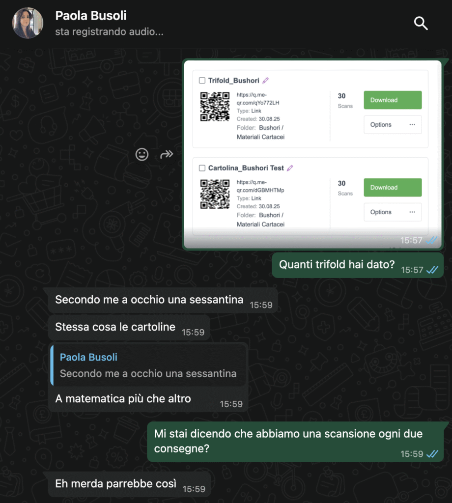
Paola’s feedback confirms the success
The Partnership with Professional Copywriting
A high-conversion design needs solid strategic foundations. Daniel Porro is a copywriter who perfectly understands the hierarchy of selling. Our job was to ensure that the persuasive force of his words wasn’t diluted, but amplified by the visual structure.
Conclusion: Is Your Marketing a Cost or an Investment?
The Bushori case demonstrates that the advertising brochure isn’t an outdated tool, but a deadly sales asset if designed with Direct Response Design criteria. If your current materials don’t generate measurable actions, you don’t have a budget problem — you have a design problem.
Want to stop producing “noise” and start generating sales?
Apply now to start a collaboration. We’ll analyze your materials and show you how to transform them into high-performance tools.
Leave a Reply