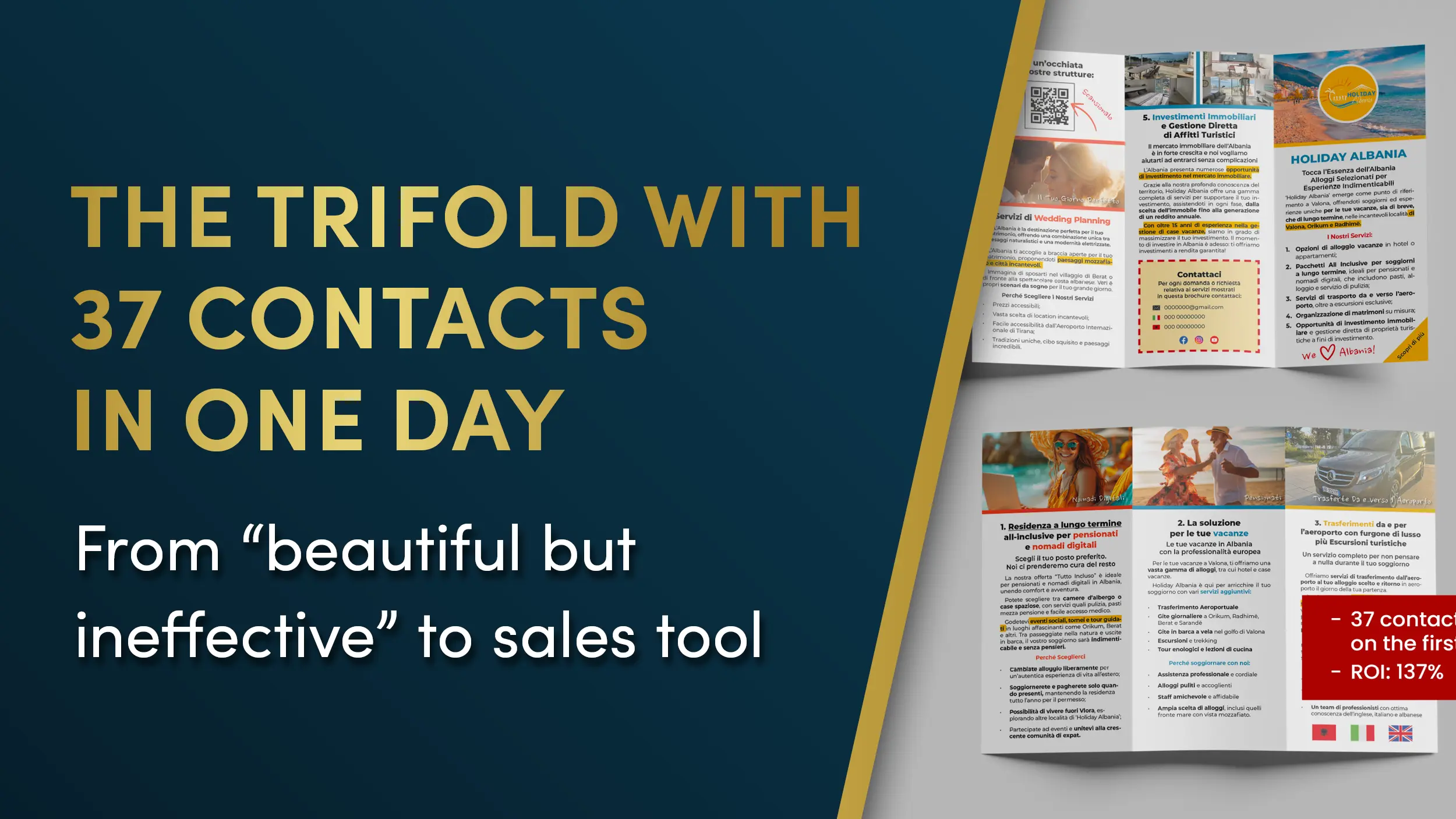
Holiday Albania contacted us after using the same tri-fold brochure at several real-estate events.
Visually, it was well done. Clean layout, nice graphics, built like an informational brochure.
But despite looking polished, it produced zero measurable conversions. No requests, no actions, no leads.
Same disease that hits most printed marketing: it was “pretty,” but not built around Direct Response Design principles.
Holiday Albania wanted to turn that tri-fold into something that could actually collect real leads during events, and most importantly, let them know whether the material was working.
The “nice but useless” problem
The original tri-fold had a classic flaw: it went all-in on aesthetics and sacrificed readability and action.
It didn’t explain the services clearly, didn’t guide the eye, and didn’t include any measurable call to action. It was a brand-presence piece, not a sales asset.
From a DRD point of view, three core elements of direct-response marketing were missing:
no visual path to steer reading
key info buried inside the graphics
no clear CTA to verify performance
The worst gap was the lack of a measurable action. Without a specific goal, any printed marketing piece loses its main job: generating a response.
Adding a measurable CTA: the turning point
The first thing we introduced was a trackable CTA, built around a QR code leading to a dedicated page where people could download photo sheets of available properties.
A small move, but the one that turns a tri-fold from a nice brochure into a conversion tool.
The CTA was dead simple:
Scan. Browse the properties. Leave your contact.
From that moment on, every action could be tracked.
Full redesign using DRD principles
Once the next step was clear, we rebuilt the tri-fold around direct-response rules: clarity, readability, eye flow, visual hierarchy, and lower cognitive effort.
The three panels became three focused modules, one per service, with only essential info, organized and instantly understandable.
Then we:
increased typographic readability (size, line spacing, whitespace)
stripped out anything that didn’t support the message
made the contact area impossible to miss
rebuilt the eye path from first opening to the CTA
turned the brochure into a coherent, clear, action-driven piece
Less decorative, more structured. But now it worked.
And above all, it made the message easy to read without effort.
Event day: the design does its job
At the official presentation, the redesigned tri-fold started doing what a well-built printed marketing asset is supposed to do: generate conversions.
People opened it, found the services explained clearly, spotted the CTA, scanned the QR code.
In just a few hours, Holiday Albania collected 37 real contacts, all tracked directly from the brochure.
Not luck.
Just the difference between graphic design that looks good and graphic design built to sell.
Want to fix your materials without starting from scratch?
If you’ve got a flyer, brochure, or tri-fold that “looks nice” but doesn’t bring in leads… chances are nothing needs to be reinvented. It needs to be reorganized.
That’s why the DRD Video Check-up exists.
You send me your material. I analyze it properly. You get a detailed video where I show you:
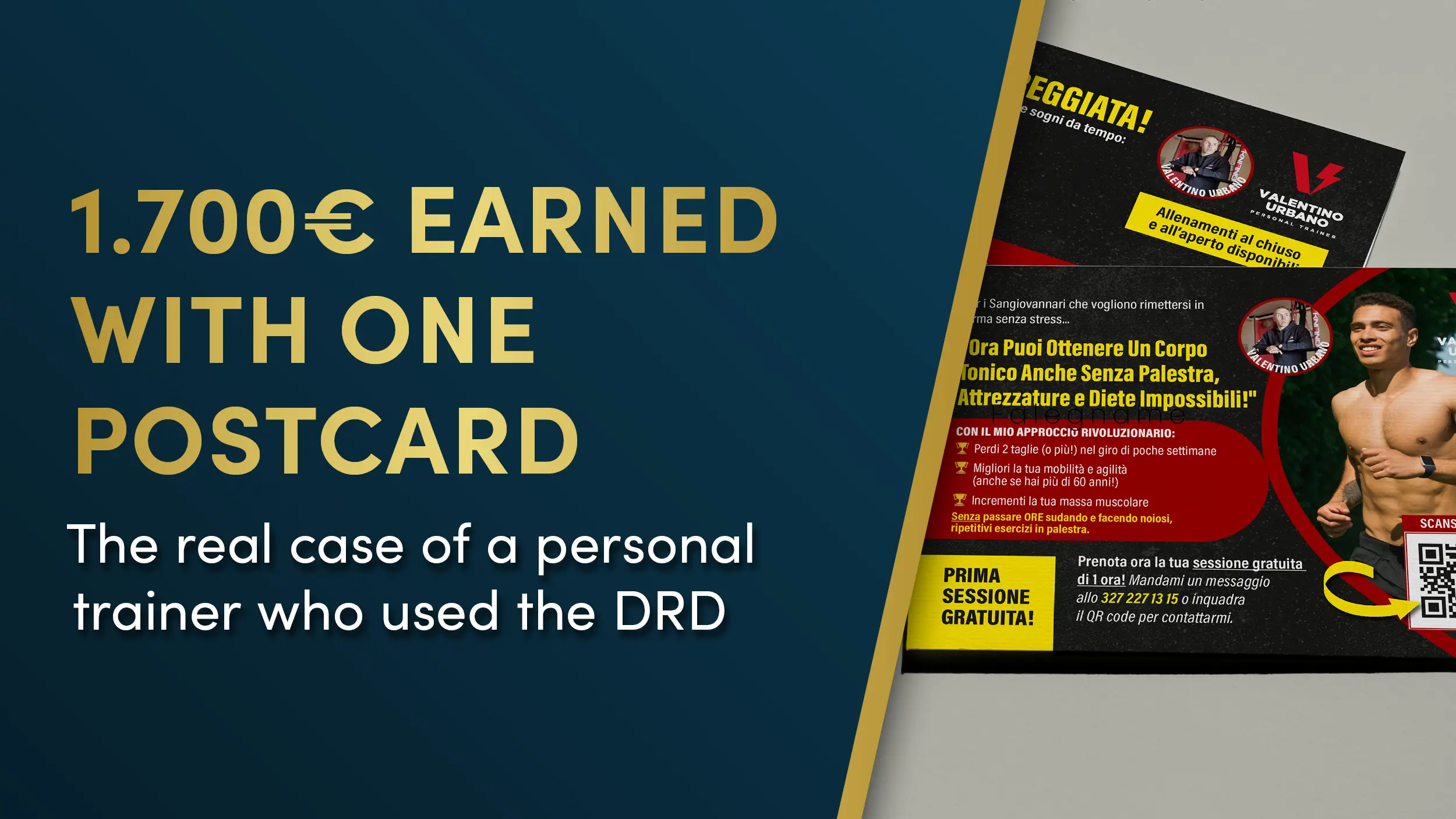
Valentino is a personal trainer with a solid local following: happy clients, steady word of mouth, a clean reputation.
What he didn’t have was a predictable stream of new leads.
He didn’t want to invest online. Too many unknowns, too much waste. He was looking for something more direct, trackable, and suited to the pace of his neighborhood: a clear, simple message that was impossible to ignore.
who nailed the promise perfectly: specific, appealing, and aligned with how a local audience actually thinks.
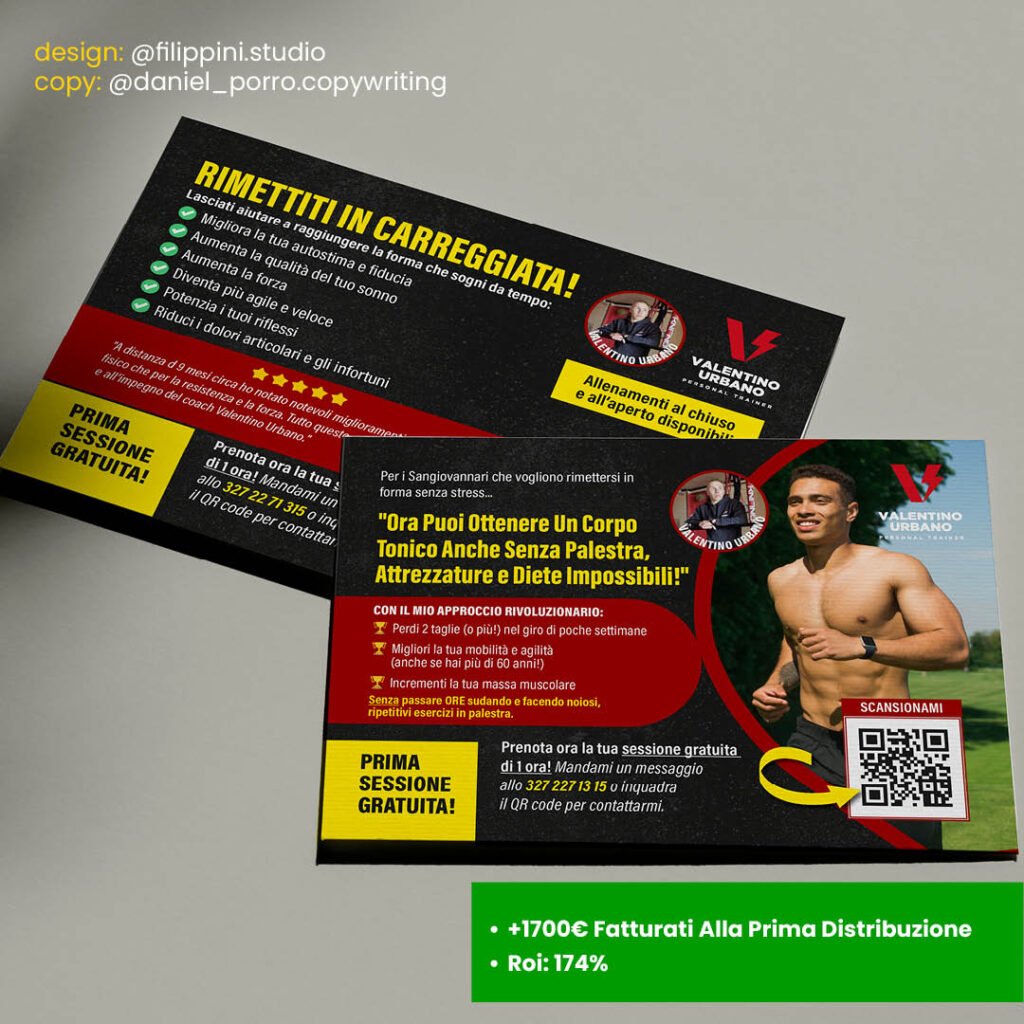
Our job was to turn that text into a direct-response postcard, something you can understand at a glance and built to produce one thing only: real contacts.
The problem to solve
This wasn’t about “making a nice-looking design.”
It was about creating a physical asset that could:
grab the attention of people who see dozens of flyers every week
communicate the benefit in under two seconds
guide the eye toward a measurable CTA
lower resistance with a non-advertising look and feel
turn a neighborhood into a direct source of leads
In other words, we needed a postcard that worked like a direct-response marketing tool, not like an aesthetic exercise.
What we did (DRD solutions applied)
boosted the copy by placing the promise, benefits, and CTA in the highest-attention visual spots
designed a layout based on visual gravity and a natural eye path
improved readability with larger type, more breathing room between blocks, and sharp contrast
reduced cognitive load by removing anything that didn’t push toward the CTA
used a Trojan Horse visual tone: non-salesy, reassuring, direct
added a measurable WhatsApp CTA to track every single contact
built a visual hierarchy that lets you understand “who you are + what you do + what I want from you” in under 3 second
Results
Valentino handed out the postcard once, in a very tight local area.
the ability to repeat the same campaign in other areas at near-zero extra cost
That’s the combined effect of direct-response copy + design built to sell.
Want materials people read instantly and that turn interest into measurable leads?
Request your Graphic Video-checkup: within 72 hours you’ll get a full video review of your piece plus a document with every improvement, ranked by priority.
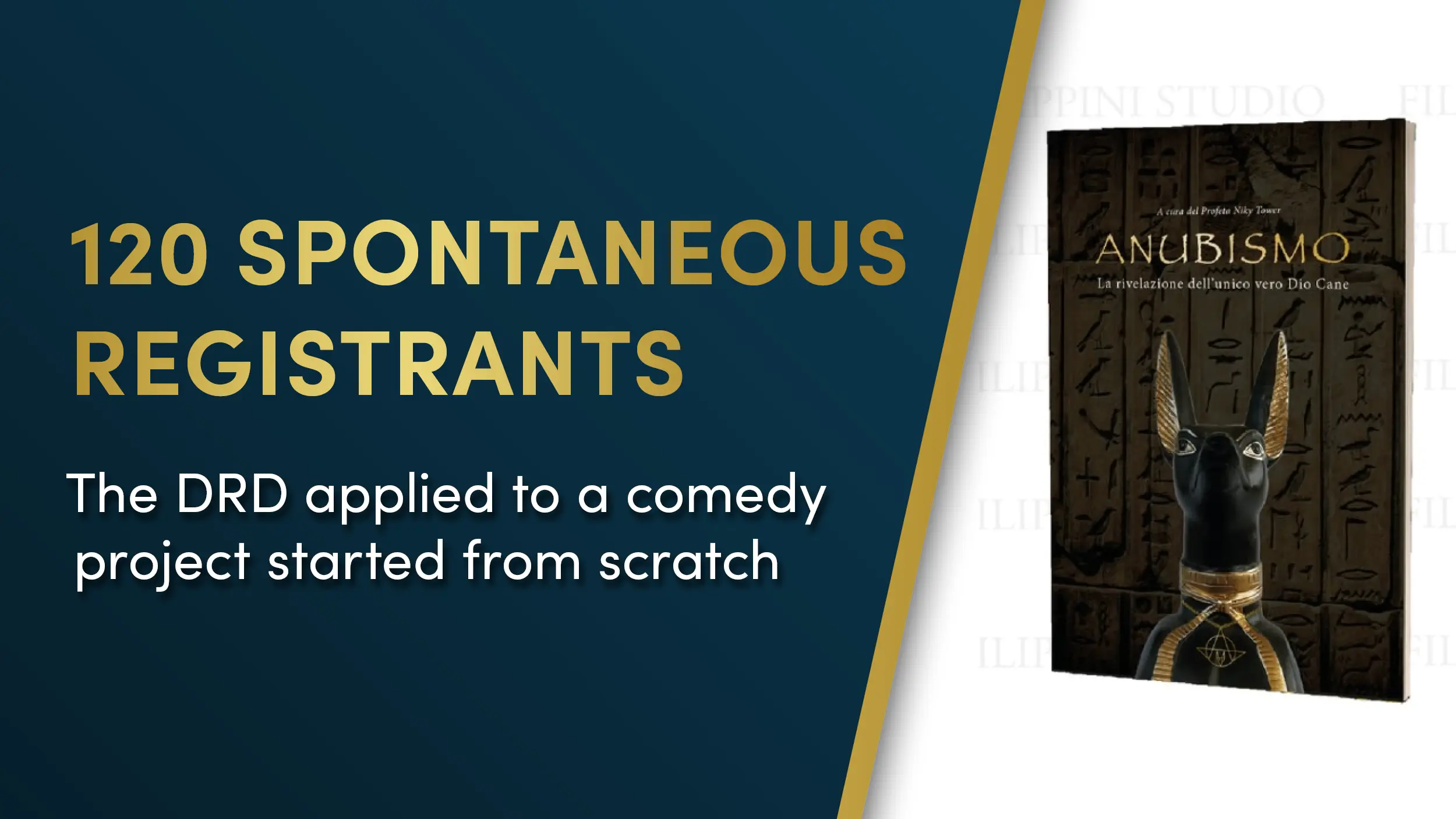
When the creator of Anubism reached out to us, our first reaction was pretty blunt: we thought it had to be a prank.
A “parody religion”? On purpose. Funny, irreverent, half satire, half fictional world-building?
It sounded like exactly the kind of thing that usually turns into a visual mess.
Then we read the first chapters.
They were so weird and so genuinely funny… that we said yes.
Not to joke around, but to see if we could turn something absurd into a real, solid design project.
Context
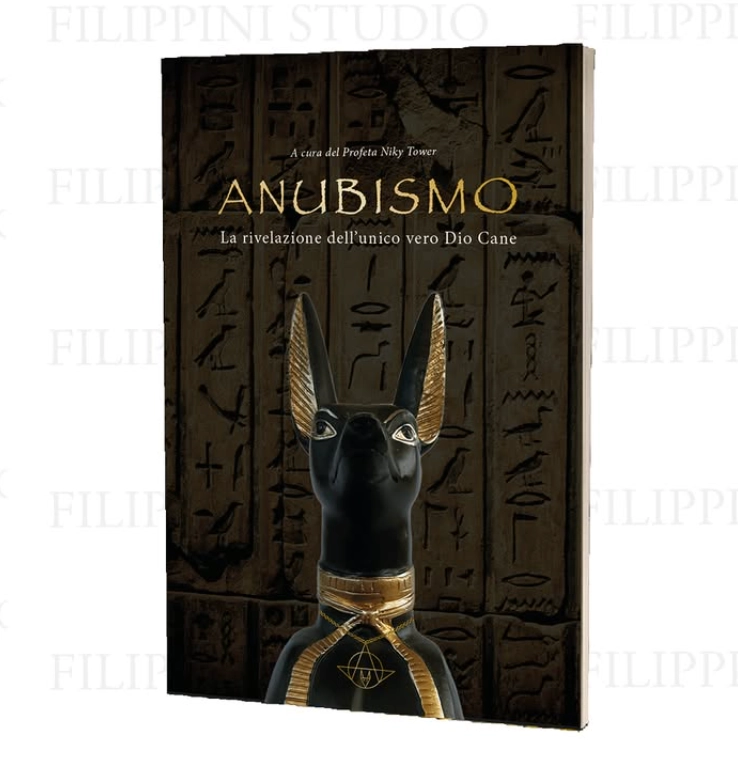
Anubism started as a satirical pseudo-religion, built to be ironic and deliberately over the top.
There was no plan to scale it. No marketing strategy, no funnel, no paid ads, no budget.
It was created just for fun.
Still, it needed a bit of structure:
a book people could actually read, a consistent visual identity, and a place to gather (a Telegram group) for anyone who wanted to “join” for the meme.
The challenge
Starting from scratch, three problems stood out immediately:
how to give a clear visual shape to something intentionally ridiculous
how to keep the book smooth and readable even with a comedic tone
how to create a simple interaction path so curious people didn’t drift away
The biggest risk was predictable: sliding into that classic parody-project chaos where everything looks “ugly on purpose” and readability dies.
When everything is ironic, everything starts to look like a joke in the worst way.
But comedy doesn’t mean sloppy design.
If you want people to laugh, they need to get through the text first.
What we did
We treated it like a serious Direct Response Design job:
Clean, comfortable typography: font, size, and spacing chosen to make reading effortless
a clear visual flow: no noise, no random elements interrupting the eye
a sober, almost “official” style: the perfect Trojan horse for satire (the more serious it looks, the harder the parody hits)
consistency: helping keep the same orderly style inside the Telegram group too
Result
Even without any growth plan, paid campaigns, or funnels:
120 people joined the Telegram group on their own
over 80 copies of the book sold over time
the project stayed stable, readable, and easy to follow despite being ironic by nature
A funny project can still work, as long as the visual structure holds.
Order → readability→ engagement.
Good design makes even “just for fun” projects stand on their own.
Want to make a weird, ironic, or unconventional project easier to read?
The free graphic video checkup is the quickest way to see what’s not working in your materials, where readability drops, and how to fix the visual path.
I review your file, record a video breakdown, and send you improvements to boost order and clarity.
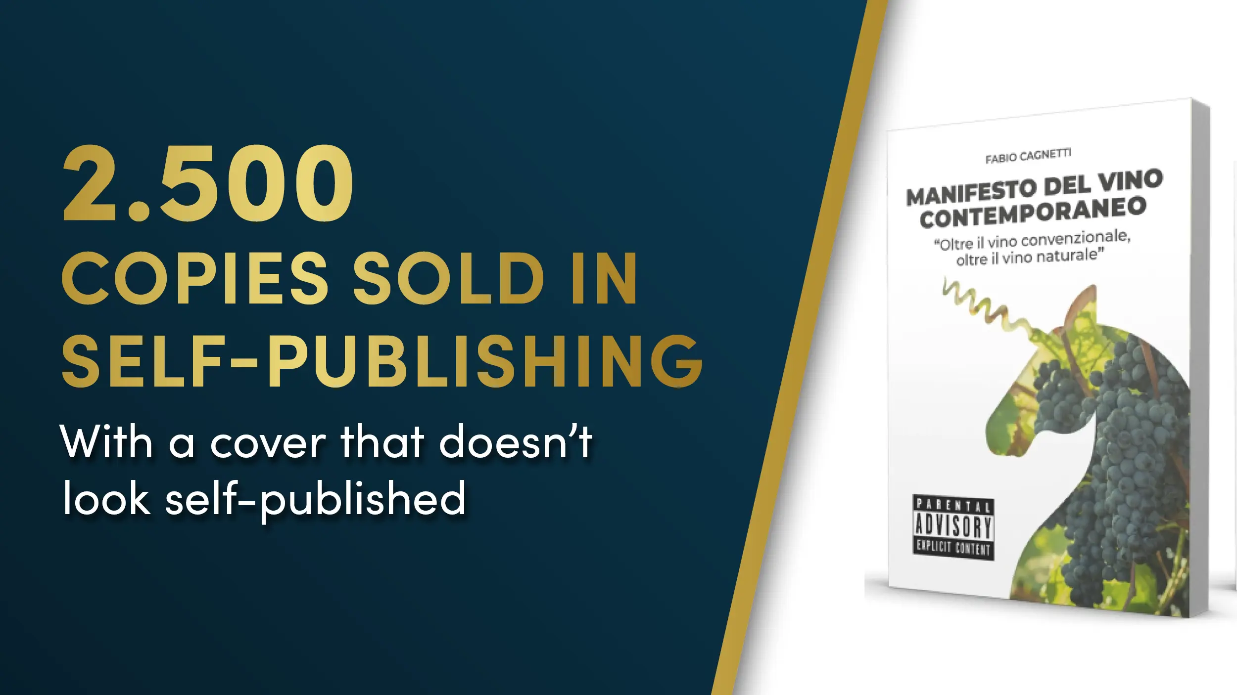
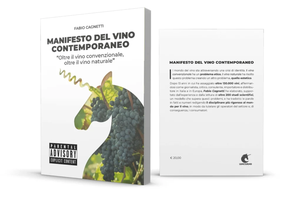
The author wanted to create an authoritative book on contemporary wine without falling into the usual institutional aesthetic that dominates the sector. The goal was to build a volume capable of generating consistent sales, personal recognition, and long-term credibility without the support of a publishing house.
We needed a graphic design that combined legibility, elegance, and visual positioning that would stand out from everything else on the market.
Initial diagnosis
Since there was no source material, we avoided the typical mistakes that ruin most self-published books:
banal, institutional covers or covers with cliché images
outdated fonts that convey amateurism
layout without visual rhythm
weak hierarchies that make reading difficult
faded or chaotic color palettes
no recognizable identity
structure too similar to generic books in the sector
Market analysis: the problem of self-publishing
Self-publishing is dominated by covers that all seem to come from the same mold: neutral tones, generic stock images, predictable compositions.
The implicit perception for the reader is immediate: self-published book.
For a work like Manifesto del Vino contemporaneo (Manifesto of Contemporary Wine), this would have been strategic suicide.
We therefore analyzed:
bestselling wine book covers
self-published titles that work and those that don’t sell
the shelves of specialist bookshops
the most commonly used color palettes and fonts in the sector
the most recurring visual clichés such as vineyards, wine glasses, parchments, and rustic watermarks
The result of the analysis was clear: no one was using a contemporary and authoritative aesthetic.
There was room for a cover that could truly belong in a serious bookstore.
What we did
created a cover that breaks away from self-publishing clichés with a professional look
chose a font that’s easy to read, modern, and fits the theme
picked a limited, professional color palette that conveys authority
designed a layout that guides the eye effortlessly
got rid of any unnecessary decorative elements
built a visual identity that would stand the test of time
set up an internal structure with solid hierarchies and reading rhythm
ensured a shelf appeal, not a self-published look
Results
The book sold 2,500 copies, a huge achievement for a self-published title in a complex niche market.
The most interesting thing is the public’s response: even after five years, the author is still recognized from afar as the one who wrote the Manifesto and continues to receive constant requests. Every week, two or three people want a copy.
This is a sign of successful positioning: a cover that is not only beautiful but designed to sell over time.
Evidence
“2,500 copies of the book sold (!) and even after five years, people still say to me: Ah, you’re the one who wrote… Now I have to work on a second edition because every week two or three people ask me for a copy.”
Call to Action
Do you want to understand how much your book’s cover or layout is helping or hindering sales?
Request your Free Video Checkup Chart: receive a complete video analysis of your material with immediate priorities and corrections to apply.
after more than 5 years in this field, having created graphics for the top players in Italian direct marketing and having trained a dozen designers to work in this field, I have realized that there are 3 indispensable elements that you need to look for in your graphic designer to make sure you are taking your conversions to the max.
The world of graphic design is a strange one: for many years the graphic design academies themselves have educated graphic designers to think along the lines of aesthetic beauty, leaving out aspects such as sales and conversion rates.
But that mindset might have proved successful until before the arrival of the Internet, or at any rate in an unsaturated market: the moment there are few competitors, it is easier to emerge.
But when making “beautiful graphics” is within everyone’s reach, the situation changes, and quite a bit, too. At that point being aesthetically beautiful is a given, while copy becomes more central than ever to the success of the campaign.
However, the more saturated the market becomes and the more complex the offerings become, the more the copy needed for persuasion becomes longer. Both in terms of the number of words and the amount of publication.
People are increasingly wary and hard to persuade. Partly because they’ve taken several burns from your competitors, partly because galloping inflation makes everyone much more conservative in choosing how to allocate their money.
I bet you are in the same situation when it comes to designers.
You tried to hire several designers who seemed to want to sabotage your work because they were not trained in direct marketing;
Designers who seemed more concerned about the campaign being aesthetically pleasing rather than readable, choosing unreadable fonts or giving high priority to images;
Designers who would go so far as to question your copy and the entire campaign, trying to persuade you to follow some strange creative method studied in traditional marketing books that had nothing to do with direct marketing.
If you too have found yourself in one or more of these situations, then read all the way through today’s article because I will provide you with the 3 pillars of direct response graphics that you need to look for in your graphic designer.
And if you don’t find a chart that already has them, you can at least try to NEGOTIATE them, explaining how critical it is for you that they follow these 3 points in order to work with you.
By making these 3 points clear from the start it will be much easier to work with him and ensure that your copy comes out stronger than ever.
So I encourage you to read the next few paragraphs carefully because they will be vital in bringing as many customers as possible to read your Call To Action and offer.
1. Extreme readability
My mentor Lori Haller defines the job of direct response designer this way:
“As a designer, my only job is to make people read the copy.”
“As a designer, my only job is to make people read the copy.”
This is a fundamental teaching of the DRD, but not as popular in the world of creative graphic design , which has made eye-catching imagery its bulwark, relegating copy to a mere frill to be used creatively in turn.
This often resulted in incomprehensible and indecipherable ads more like rebuses than marketing work, where no one read a single line of text.
However, you are in the opposite situation: copy is king, not images. Which is why you need to agree with your designer from the outset on the nature of the texts you write.
Explain to him clearly that they are not decorations, but the beating heart of what you are doing and that his job is to make them extremely readable. At the cost of lowering the aesthetic beauty by a few degrees.
I’ll let you in on a secret: design, when really good, is practically invisible.
It becomes so because it is simply serving the general purpose of marketing material: to sell.
In short, the important thing is that what you have written is easy to read, practically automatically!
That means choosing a simple font but with lots of weights, so you can play with the cosmetics and make it as vivid as possible.
What are cosmetics?
I have devoted an entire book to the topic, which you can download for free from here.
2. Optical path
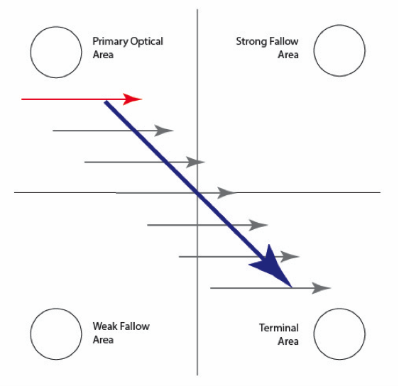
The second key aspect to check in your designer is whether he or she is aware of the importance of optical path and reading gravity.
Two key aspects of making reading as natural as possible that are impossible to do without in the direct marketing world.
The hierarchy of information must be extremely clear and it must be natural for the eye to navigate within the copy.
To accomplish this task, it is essential to keep the following scheme in mind:
As you can see, our eye naturally starts reading from the top left and ends at the bottom right, which means these are respectively the ideal places to place headline and call to action.
But too often I have seen these elements placed in the wrong places, screwing up the copywriter’s work.
Just as I have seen too many times the designer fail to use sub headlines because they “didn’t look right,” when these are absolutely critical to giving the reader different doorways into our copy.
A deep understanding of the optical path, visual hierarchy and reading gravity are the essential basis for creating layouts that make reading as natural as possible, discarding out of hand all those creative but unreadable solutions that often appear in the advertising world.
3. Emotional Engagement
Once the readability and optical path are established, it is finally time to use colors and images. Not before as I often see it done.
It is essential to first fix the readability of the text and only then to choose images and colors to make it come alive and emotionally support the copy.
And in this regard, to make sure that the graphic designer you choose can unleash the full power of your copy, it is absolutely essential that he or she knows at least the basics:
Proof elements;
Benefits;
Fears;
These are the three basic elements to highlight with images and colors when working on copy. Images in particular must best represent these elements.
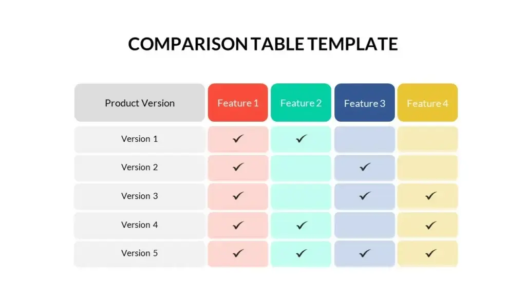
Test elements, for example, can easily become charts, statistics, comparative tables between two or more services.
Benefits are easily shown with images of happy people using the product or service.
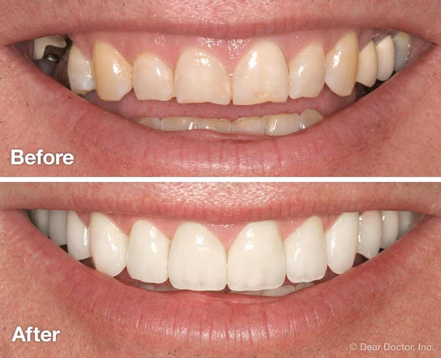
Before/after images also prove extremely valuable for these purposes. They are also increasingly easy to make thanks to AIs that can create images tailored to our needs, bypassing the hours spent among stocks searching for the perfect image.
Fears, on the other hand, should be represented with caution: it is always better to represent the bright smile than the bad tooth. In general, benefits are more desirable and positive situations, in general, turn out to be much more attractive than negative ones.
My recommendation is to always have images of your product or service made by a professional photographer-they are the best long-term investment since they can be reused over and over again in different materials and different campaigns.
Regarding colors, the moment a brand is present, it is essential to follow its guidelines consistently. It is true: it will have a more “advertising” appearance, but a consistent appearance will also be proof of the seriousness of the company, especially when the customer or lead sees us for the second time.
In short, emotional engagement should not be entrusted simply to the beauty of images, but should be done while respecting the copy and its basic arguments. Each graphic element we choose must be an enhancer of the copy and not a substitute for it.
That is why it will be critical to make sure that your graphic designer understands this basic need and demonstrates a willingness to understand at least the basic mechanics of direct copy. The benefits will be evident from the first processing.
Your copy deserves a designer who will make it shine
If you’re a direct copywriter and want to focus only on what you do best-writing and selling-
now is the time to partner with a designer who specializes in Direct Response Design, and who knows the rules of readability, visual pathing, and emotional empowerment of copy.
I have created a partnership tailor-made for A-list copywriters, with clear workflow, respected timelines, and a single goal: to make your campaigns perform better.
In a saturated and hyper-competitive market, true top-tier copywriters do not just create persuasive text: they protect its effectiveness and multiply its results.
How?
Counting on a hidden yet essential partner: Direct Response Design.
In this article, I explain why this has become the true competitive advantage for those who want not just to survive, but to dominate.
Artificial intelligence has changed everything.
It made creating copies a thousand times simpler.
It has made it a thousand times harder to stand out.
Writing has never been so easy.
But every day millions of texts are born to die in the noise.
Today, it’s not enough to be good: you must become impossible to ignore.
The new challenge for Serie A copywriters
It’s no longer about writing better than others.
It’s being read all the way through.
If your message doesn’t arrive intact in the reader’s mind, it’s as if it doesn’t exist.
Too often today, the wrong design kills a winning copy before it can even play its game.
Why Direct Response Design is even more essential today
Direct Response Design is not just an embellishment.
It is an invisible guide that holds the reader’s hand and leads them, never letting them stumble, until your call to action.
Here’s what it really does:
It guides the eye with surgical precision.
It protects your headline and makes it stand out like a beacon in the sea.
It draws the reader line after line, without losing attention.
It amplifies the power of the copy without changing a single comma.
AI cannot replace this
Can write a good draft.
Can format generic templates.
But it still cannot design visual paths intended for the human mind.
Only a direct response designer knows:
Where the eye stops
Where it accelerates
Where it jams
And it knows how to build an invisible path that takes the reader straight to the CTA.
If you don’t direct your reader, you risk losing them.
Every unread word = a missed sale.
Ogni headline ignorata = un’opportunità buttata.
Each poorly presented page = an invisible loss of ROI.
Thinking that “a good text is enough” today is like leaving an important letter in a bottle in the middle of the ocean.
Perhaps it will come. But much more likely it will be ignored.
Your job is not only to write well.
It is to have your text perceived, assimilated, acted upon.
Why choose Keryx Design as your ally
3 years managing the graphics department of the biggest italian direct marketing companu
Operating system broken in over hundreds of campaigns
Absolute respect for your copy
Visual optimization to increase response
Zero decoration. Just results.
We don’t design for vanity.
We design to make your clients read, to make you convert, to make you win.
Those who write well survive.
Those who write well and get read dominate.
If you want to be among the few who really emerge, you can no longer fight this war alone.
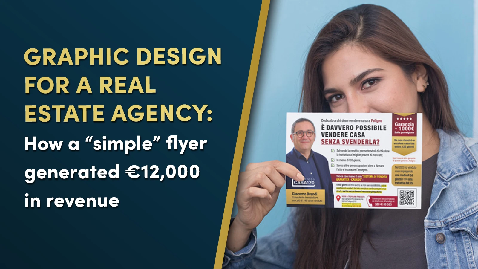
This flyer isn’t winning design awards. But it generated €12,000 in commissions while the “beautiful” version sat in trash cans.
If you write to persuade, you know the frustration: you write a strong sales argument, hand it to a designer, and what comes back looks like it belongs in a museum—but converts like a brick.
This is the story of how we broke that pattern for Giacomo Brandi, a 20-year veteran real estate agent in Italy. Not by making it “prettier.” By engineering it to do one job: get your copy read all the way to the call to action.
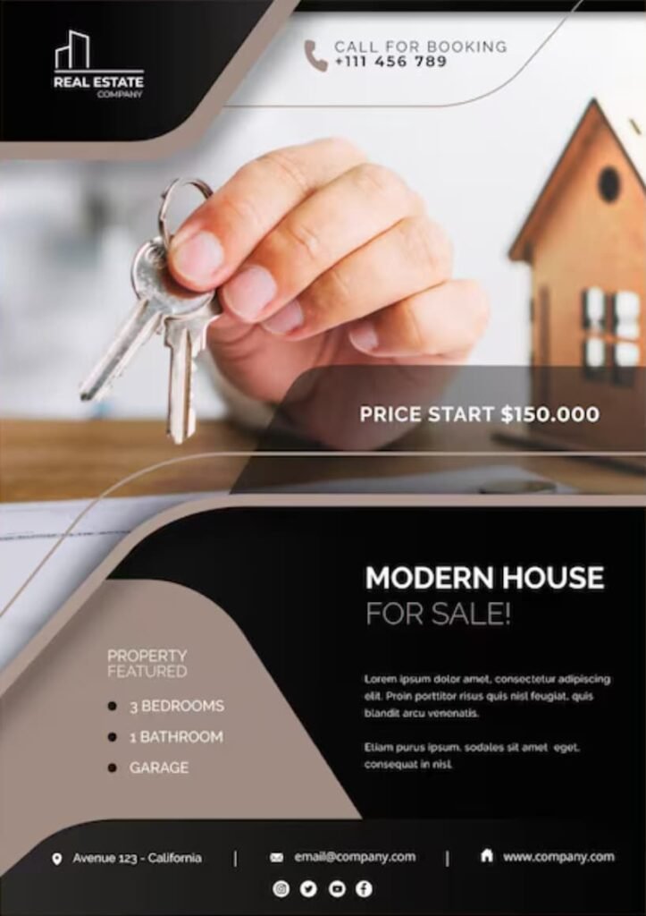
The “Beautiful” Competitor That Nobody Called
Before we show you what worked, here’s what didn’t.
This is the kind of flyer most real estate agents use. Clean. Professional. Aesthetically perfect.
And completely useless.
Why it fails everytime:
The giant hero image dominates 70% of the real estate
Your eye hits the photo, recognizes “this is an ad,” and the brain shuts off
The copy is generic and doesnt talk to the reader
There’s nowhere for the eye to go after the initial impression
No visual path guiding the prospect to the CTA
The designer did their job—it looks great. But the copywriter’s message never had a chance.
What We Did Differently: Three Visual Principles That Amplified The Copy
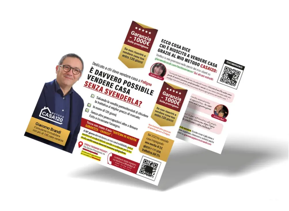
Giacomo’s flyer breaks every “modern design” rule. And that’s exactly why it worked.
1. Visual Gravity Law
Most flyers are flat. Your eye lands somewhere and stops.
In Giacomo’s piece, every element pulls the eye downward through the copy. The headline hooks attention. The layout prevents the eye from sliding off. Each visual element pushes you to the next line. The photo isn’t the destination—it’s part of the journey toward the offer.
For copywriters: Your argument flows uninterrupted from problem to solution to call-to-action.
2. Information Density
Here’s where “creative” designers fail copywriters: they’re terrified of text.
“People don’t read,” they say. “Keep it minimal.”
Bullshit. People read what interests them.
Giacomo’s flyer is text-heavy by modern standards. We gave the copy room to make a complete argument: problem identification, credibility markers, benefit stack, social proof, clear next step.
For copywriters: Your persuasive argument needs space to develop. This layout gave your words the real estate they deserved.
3. Functional Humanity
Yes, Giacomo’s face is on the flyer. But it’s not the star.
The photo appears AFTER the headline hooks interest. It’s sized to build trust, not showcase ego. It functions as a credibility seal while you read the offer.
For copywriters: Your words do the selling. The photo does the trust-building.
The Results
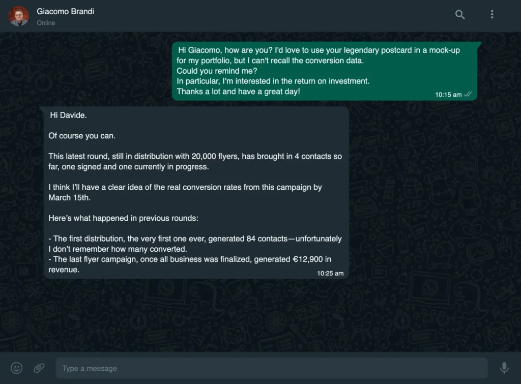
What happened:
4 property owners called
1 signed an exclusive listing contract
1 additional lead in advanced negotiation
€12,000+ in estimated commissions
Not because the flyer was “magical.” Because it guided the eye through the sales argument without resistance.
The copy worked because the design didn’t sabotage it.
Stop Letting Beautiful Design Kill Your Copy
Here’s the truth most copywriters learn the hard way:
You can write the strongest sales letter in the world. But if the layout screams “ad,” breaks the visual flow, or buries your call-to-action under a giant stock photo, your prospect never makes it to the close.
Giacomo didn’t get €12,000 in results because he’s “lucky” or because his market is easy. He got results because we stopped treating his flyer like a brochure and started treating it like a sales tool engineered to convert.
Work With Someone Who Treats Your Words Like They Matter
I don’t do “creative” design for everyone. I work exclusively with copywriters and direct response professionals who measure success in conversions, not compliments.
If you’re tired of watching beautiful layouts generate ugly response rates, it’s time for a different approach.
I’m accepting a limited number of projects this quarter.