When the creator of Anubism reached out to us, our first reaction was pretty blunt: we thought it had to be a prank.
A “parody religion”? On purpose. Funny, irreverent, half satire, half fictional world-building?
It sounded like exactly the kind of thing that usually turns into a visual mess.
Then we read the first chapters.
They were so weird and so genuinely funny… that we said yes.
Not to joke around, but to see if we could turn something absurd into a real, solid design project.
Context
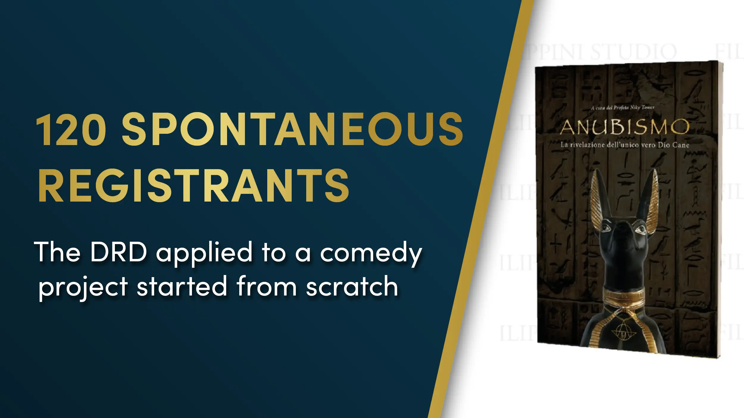
Anubism started as a satirical pseudo-religion, built to be ironic and deliberately over the top.
There was no plan to scale it. No marketing strategy, no funnel, no paid ads, no budget.
It was created just for fun.
Still, it needed a bit of structure:
a book people could actually read, a consistent visual identity, and a place to gather (a Telegram group) for anyone who wanted to “join” for the meme.
The challenge
Starting from scratch, three problems stood out immediately:
-
how to give a clear visual shape to something intentionally ridiculous
-
how to keep the book smooth and readable even with a comedic tone
-
how to create a simple interaction path so curious people didn’t drift away
The biggest risk was predictable: sliding into that classic parody-project chaos where everything looks “ugly on purpose” and readability dies.
When everything is ironic, everything starts to look like a joke in the worst way.
But comedy doesn’t mean sloppy design.
If you want people to laugh, they need to get through the text first.
What we did
We treated it like a serious Direct Response Design job:
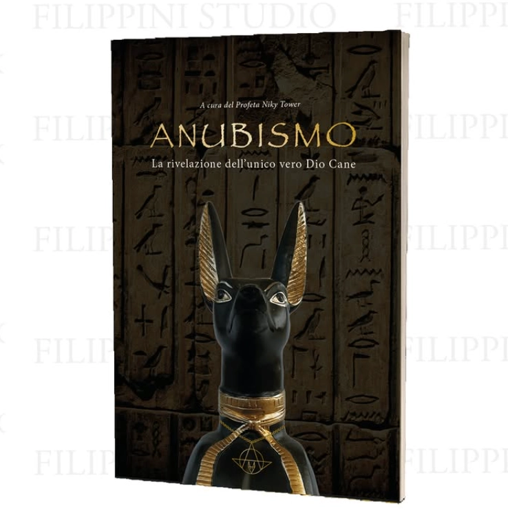
- Clean, comfortable typography: font, size, and spacing chosen to make reading effortless
- a clear visual flow: no noise, no random elements interrupting the eye
- a sober, almost “official” style: the perfect Trojan horse for satire (the more serious it looks, the harder the parody hits)
- consistency: helping keep the same orderly style inside the Telegram group too
Result
Even without any growth plan, paid campaigns, or funnels:
- 120 people joined the Telegram group on their own
- over 80 copies of the book sold over time
- the project stayed stable, readable, and easy to follow despite being ironic by nature
A funny project can still work, as long as the visual structure holds.
Order → readability→ engagement.
Good design makes even “just for fun” projects stand on their own.
Want to make a weird, ironic, or unconventional project easier to read?
The free graphic video checkup is the quickest way to see what’s not working in your materials, where readability drops, and how to fix the visual path.
I review your file, record a video breakdown, and send you improvements to boost order and clarity.
If you want, we can go through it together.
Leave a Reply