Category: Case Study

  • What does an independent book that has sold 2,500 copies look like?

    What does an independent book that has sold 2,500 copies look like?

    Context

    The author wanted to create an authoritative book on contemporary wine without falling into the usual institutional aesthetic that dominates the sector. The goal was to build a volume capable of generating consistent sales, personal recognition, and long-term credibility without the support of a publishing house.

    We needed a graphic design that combined legibility, elegance, and visual positioning that would stand out from everything else on the market.

    Initial diagnosis

    Since there was no source material, we avoided the typical mistakes that ruin most self-published books:

    • banal, institutional covers or covers with cliché images
    • outdated fonts that convey amateurism
    • layout without visual rhythm
    • weak hierarchies that make reading difficult
    • faded or chaotic color palettes
    • no recognizable identity
    • structure too similar to generic books in the sector

    Market analysis: the problem of self-publishing

    Self-publishing is dominated by covers that all seem to come from the same mold: neutral tones, generic stock images, predictable compositions.

    The implicit perception for the reader is immediate: self-published book.

    For a work like Manifesto del Vino contemporaneo (Manifesto of Contemporary Wine), this would have been strategic suicide.

    We therefore analyzed:

    • bestselling wine book covers
    • self-published titles that work and those that don’t sell
    • the shelves of specialist bookshops
    • the most commonly used color palettes and fonts in the sector
    • the most recurring visual clichés such as vineyards, wine glasses, parchments, and rustic watermarks

    The result of the analysis was clear: no one was using a contemporary and authoritative aesthetic.

    There was room for a cover that could truly belong in a serious bookstore.

    What we did

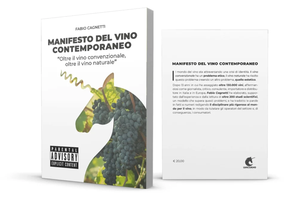
    • created a cover that breaks away from self-publishing clichés with a professional look
    • chose a font that’s easy to read, modern, and fits the theme
    • picked a limited, professional color palette that conveys authority
    • designed a layout that guides the eye effortlessly
    • got rid of any unnecessary decorative elements
    • built a visual identity that would stand the test of time
    • set up an internal structure with solid hierarchies and reading rhythm
    • ensured a shelf appeal, not a self-published look

    Results

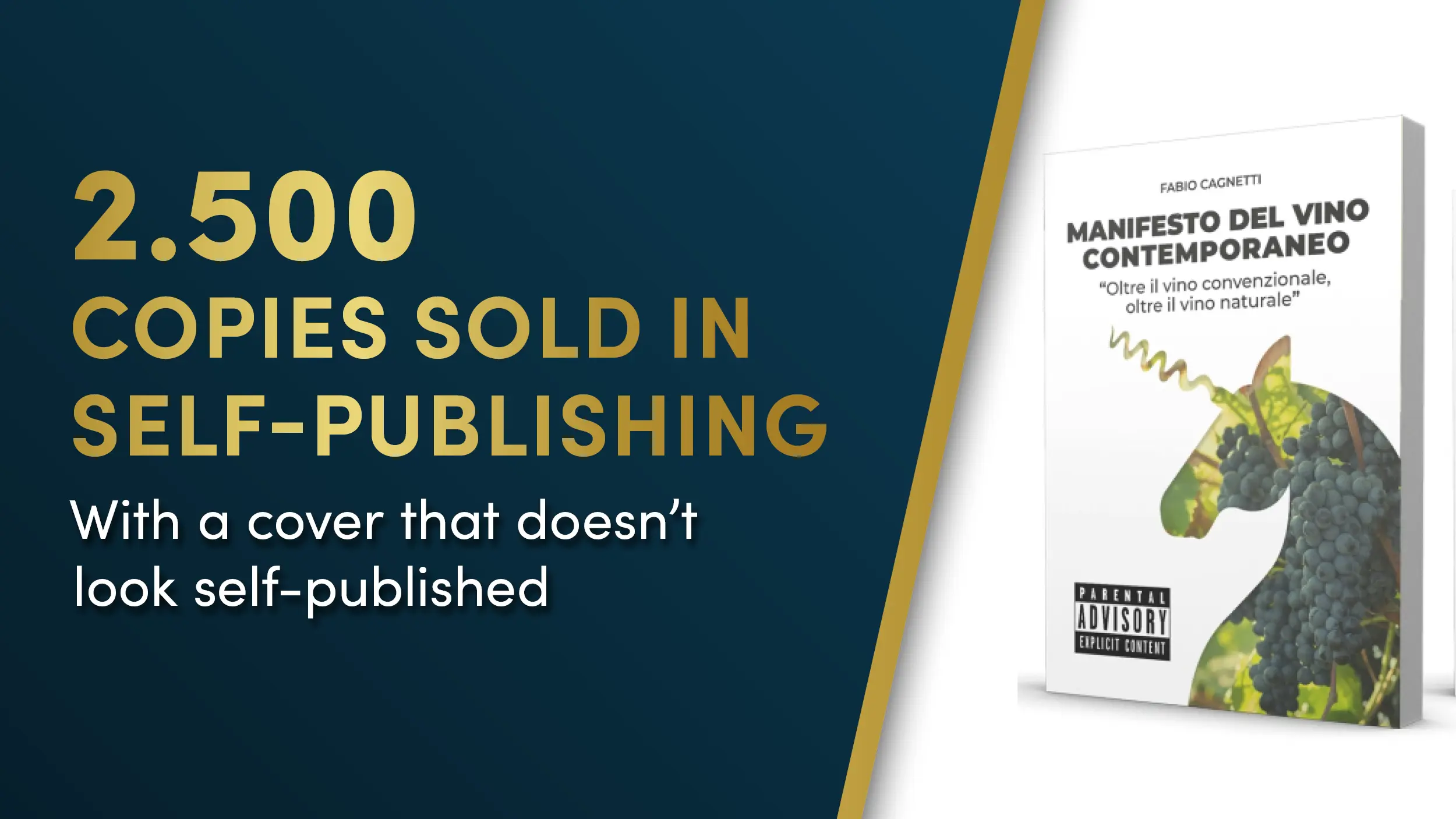
    The book sold 2,500 copies, a huge achievement for a self-published title in a complex niche market.

    The most interesting thing is the public’s response: even after five years, the author is still recognized from afar as the one who wrote the Manifesto and continues to receive constant requests. Every week, two or three people want a copy.

    This is a sign of successful positioning: a cover that is not only beautiful but designed to sell over time.

    Evidence

    “2,500 copies of the book sold (!) and even after five years, people still say to me: Ah, you’re the one who wrote… Now I have to work on a second edition because every week two or three people ask me for a copy.”

    Call to Action

    Do you want to understand how much your book’s cover or layout is helping or hindering sales?

    Request your Free Video Checkup Chart: receive a complete video analysis of your material with immediate priorities and corrections to apply.

  • How a Simple Flyer Generated €12,000 in Revenue (and Keeps Doing So Every Time It’s Sent)

    How a Simple Flyer Generated €12,000 in Revenue (and Keeps Doing So Every Time It’s Sent)

    Why your paper materials don’t work (and it’s not your fault)

    Have you ever distributed 500 flyers and received zero calls?

    It’s not your fault. It’s the design’s fault

    If you are a real estate agent, you have probably experienced this: you print a flyer, distribute it in the neighborhood, but don’t receive a single call.

    You wonder if the area is wrong, if people don’t have homes to sell, or if it’s simply “pointless to do paperwork” in 2025.

    And no. The problem is not the paper.

    The problem is how it is used.

    A beautiful design can make you look professional. A direct response design helps you earn.

    The most common mistakes in real estate agents’ materials

    • Lack of a large, easily readable headline even from a distance
    • Total lack of testimonials
    • No explicit benefit for the customer
    • Use of overly generic templates with no concrete message
    • No guarantee
    • No inviting and “low-effort” call to action for the customer
    • And I could go on for a long time…

    Result? Whoever gets that flyer throws it away.

    Not because I don’t have a house to sell.

    But because he/she did not find a concrete reason to contact you.

    Comparison Table

    The Giacomo case study: $12,000 from a discarded flyer

    Giacomo Brandi has been working in Foligno for over 20 years.

    Every two months, he drops a paper flyer in his designated area.

    No magic: just a design made for one purpose. To make the phone ring.

    In the last campaign, 3 people contacted him. All three had a house to sell.

    They entrusted it to him. Result: Over €12,000 in commissions generated.

    What was different about that flyer?

    • The text was built to tap into the real motivations of those who have a home to sell (not just to say “how good Giacomo is”)
    • The design was invisible: it guided the eye, highlighted key points, and pushed toward action.
    • The CTA was simple, readable, and targeted: “Do you have a home to sell in the area? Call me, no obligation. I’ll explain how much it’s worth today.”

    No special effects are required. What you need is a design designed for sales.

    Would you like to try a custom flyer for your real estate agency?

    If you also want to stop wasting money on flyers that don’t deliver results, I suggest this:

    Donna sorridente seduta su una sedia verde acqua con in mano una cartolina A5 per la vendita immobiliare a Foligno, creata da Giacomo Brandi con messaggio “È davvero possibile vendere casa senza svenderla?”

    Discover my direct response postcards and how to use them in your area.

    It can be a postcard to mail, a flyer to bring to appointments, or a PDF to send via WhatsApp.

    The important thing is that it does its job: to get you in touch with those who really have a house to sell.

    Contact us here: https://filippinistudio.com/en/contacts/

    PS: I’m not offering you a frame-worthy design. I’m providing you a tool to use. And if you use it well… it could become your best seller.