Category: Case Study

  • Slashing Lead Costs by 76%: From €25 to €6 for a Construction Company

    Slashing Lead Costs by 76%: From €25 to €6 for a Construction Company

    Pietro 2002, a construction agency of excellence operating in the Brescia area, was facing a challenge common to many construction companies: total dependence on generic real estate portals (such as Immobiliare.it) for the acquisition of new clients.

    This strategy presented significant critical issues:

    • High costs: An average spend of €25 for every single lead.
    • Poor quality: Contacts were often poorly profiled and scattered among dozens of competing ads.
    • Absence of control: No direct management over the brand narrative and communication.

    When we proposed an alternative system, the objection was immediate: “It is not possible to generate direct contacts on WhatsApp for villas of this value in this way.” This was an understandable skepticism, born of a widespread belief in the sector: the idea that only big portals act as the solution for high-value properties.

    We at Keryx Design, however, knew that a decidedly more effective path existed.

    The Strategy: Direct Response Design Applied to Construction

    We responded to the challenge by designing an integrated system based on three fundamental pillars of direct response marketing.

    1. Strategic Landing Page and High-Value Lead Magnet

    We abandoned the concept of a “showcase site” to build a pure conversion landing page. The fulcrum was not a banal “contact us” button, but an irresistible Lead Magnet: a complete digital brochure that offered:

    • Detailed floor plans of each housing unit.
    • Photorealistic and professional 3D renderings.
    • Advanced technical specifications of the systems.
    • Documented energy certifications.

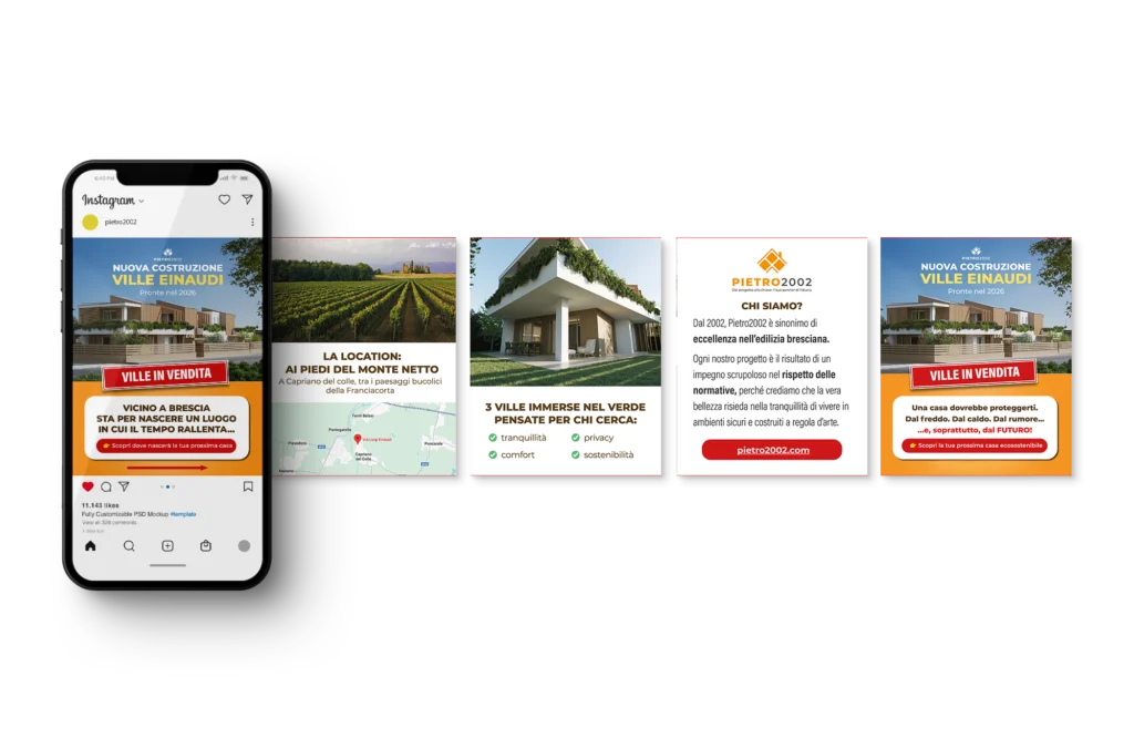
    2. ADS Campaigns with Direct Response Carousels

    The advertising strategy on Facebook and Instagram was built on carousels designed according to direct response design principles. Every element was studied to:

    • Visually guide the user towards the key message.
    • Use copy focused on the concrete benefits of living there (not just on aesthetics).
    • Drive an immediate Call-to-Action towards WhatsApp.

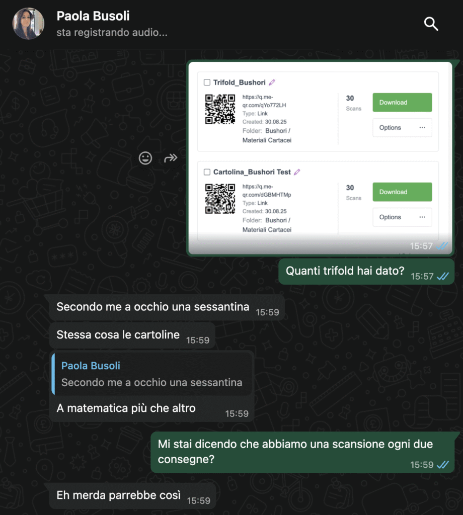
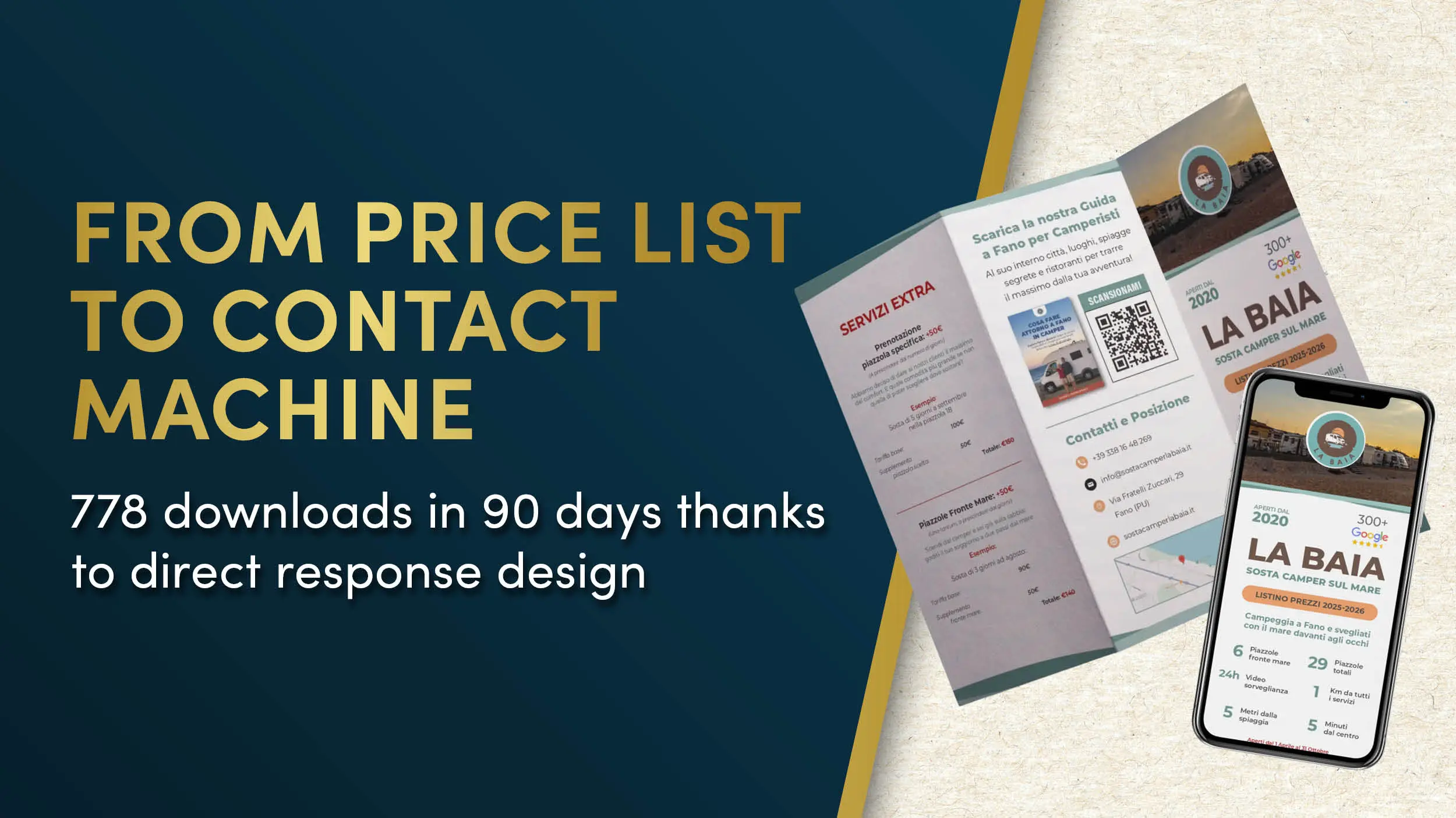
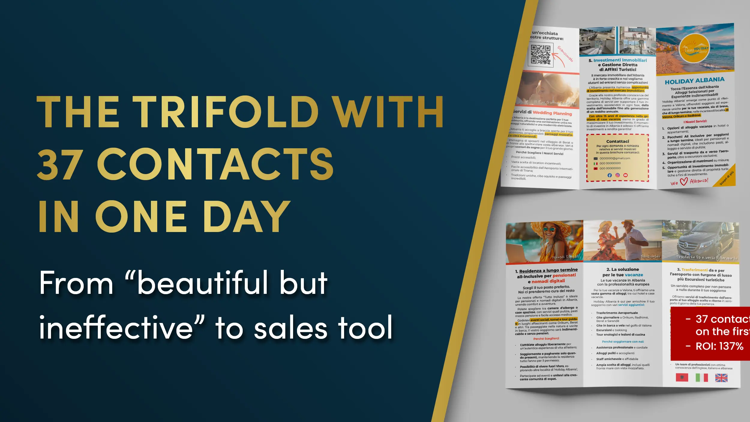
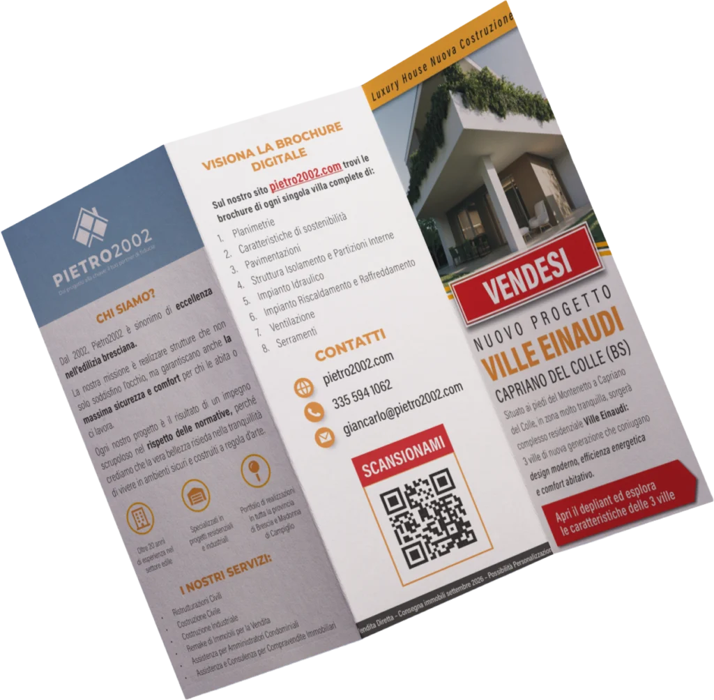
    3. Print Support: The Strategic Trifold

    To not interrupt the value experience during live negotiations, we developed a paper trifold. This tool replicates the effectiveness of the digital communication in a physical format, becoming a tangible and authoritative support during meetings with potential buyers.


    Analysis of Results: A Self-Sustaining ROI

    The initial investment of €4,000 covered the entire setup (landing page, campaigns, and print materials). The results of the first test, carried out with only €90 of advertising budget, were surprising:

    MetricResult Obtained
    Qualified Leads Generated15 contacts
    Current Cost per Lead€6
    Previous Cost per Lead€25
    Cost Reduction-76%

    The Value of Scalability

    The most relevant aspect is the Return on Investment (ROI) in the long term. With the old system, 100 leads would have required an outlay of €2,500. With the Keryx Design system, the cost drops to €600.

    Considering that the villas in the portfolio guarantee an average margin of 80-100k each, closing just one single sale is enough to repay the initial investment 20 to 25 times over.

    The client’s enthusiasm was our greatest confirmation: during the campaign activation, Pietro 2002 updated us daily on the constant arrival of new contacts and the effectiveness of conversations started instantly on WhatsApp.

    Why Did It Work? The 4 Principles of Success

    The success of this project is not the result of chance, but of the rigorous application of four cardinal principles:

    1. Specific Offer: We didn’t promote “nice houses,” but we offered solutions to concrete questions (floor plans and technical data).
    2. Elimination of Friction: We chose WhatsApp to make contact immediate, eliminating long and complex forms that discourage the user.
    3. Scientific Design: Every visual element was optimized for readability and visual hierarchy (neuroscience-compliant), guiding attention where necessary.
    4. Message Ownership: Unlike portals, where you are one of many, the proprietary landing page allows you to totally control the narrative and perceived value.

    We have a construction company and we were working on an important project with three villas under construction.

    We needed something more than a simple paper brochure: we wanted a way to make ourselves known and to get in touch with clients without having to go crazy with social media.

    We therefore chose to rely on Davide and the Keryx Design team, who followed us in the creation of our site.

    The result was exactly what we were looking for: a practical, curated, and business-oriented tool, which today we can comfortably recommend to anyone interested in having more information on the project.

    Paola F.Administrator, Pietro2002

    Lessons for Construction Companies of the Future

    This case study highlights three fundamental truths for the construction sector:

    • Generalist portals are not the only way: and often they are the least efficient choice.
    • Direct Response sells high value: it doesn’t serve only for cheap products, but it is fundamental for complex assets if applied with solid principles.
    • Lead control changes the business: managing the contact in the first person radically transforms the quality of the negotiation.

    Do you want to achieve similar results for your business?

    If your company is investing too much in low-quality leads or if your growth depends exclusively on external portals that you cannot control, we can help you.

    At Keryx Design, we are specialists in direct response design: we create marketing tools, both digital and paper, designed to amplify your message instead of sabotaging it.

    Apply for a free consultation

    We will analyze your specific case and show you how to apply this system to your business model.

  • How to Sell 150 Copies of Your Book in One Month (and Land a 2.5 Million Euro Client)

    How to Sell 150 Copies of Your Book in One Month (and Land a 2.5 Million Euro Client)


    What you are about to read is one of the projects I am most proud of.

    Not just for the results it generated, but for the journey that brought us there: a path made of doubts, revisions, deep study, earned trust, and a message that needed to be transformed into paper and, ultimately, into a direct response.

    I’m talking about Assunta Incarnato’s book. Her book is titled “Quello che i commercialisti non dicono” (What Accountants Don’t Tell You) and it sold 150 copies in the first month. But more importantly, it helped her land a new 2.5 million euro client.

    From Frustration to Success

    To think that when she first contacted me, I was already the third graphic designer she had turned to.

    Her voice on the phone was full of frustration and distrust—and I can’t blame her. She had already wasted time and money with designers who couldn’t give an effective shape to her ideas.

    What made the difference was my approach as a Direct Response Designer:

    1. First, we study the market.
    2. Then, we structure the message.
    3. Finally, we design.

    This is the exact opposite of what “creative” graphic designers do.

    But I don’t want to be the one telling you this. I’ll let her do the talking. Below you will find the full interview.


    Interview with Assunta Incarnato

    Q: Hi Assunta! How are things going?

    A: Hi Davide! I’m doing great—I just finished packing! After the results the book achieved, a nice vacation will be the icing on the cake!

    Q: Fantastic! Would you like to tell us a bit about yourself? Who are you and what do you do?

    A: That’s a tough question… while people can read about who I am and what I do directly on my blog, Incarnato.Consulting, I define myself as a Subversive Accountant.

    Q: A “Subversive Accountant”? What does that mean?

    A: It means that in a world where most accountants tend to stay on the surface and avoid getting too involved in companies and their processes, I dive in headfirst. I do this because I know it’s the only way to truly help entrepreneurs grow their businesses.

    Q: That sounds awesome! How did you end up doing what you do?

    A: I’m the daughter of entrepreneurs, so I’ve lived and breathed the company atmosphere since I was a child. I was quite good at school, but unlike what people expected, I chose not to go to a traditional high school and opted for Accounting instead. It was an unusual choice for a girl back then, but I was (and still am) madly in love with the corporate environment. I couldn’t have made a better choice.

    As soon as I graduated, I was scouted by one of the most important professional firms in Merano and started working immediately. But despite spending over 50 hours a week at my desk, I had questions inside me that found no answers:

    • What lies beyond the cold numbers?
    • How do you build and manage a successful company?
    • Why do some businesses thrive while others fail after a few years?

    So, even though the workload at the firm was insane, I started University (Economics) and graduated with top honors. I continued studying until I qualified as a Chartered Accountant.

    20 Years of Experience and a Turning Point

    From there, I began collaborating with several prestigious firms where, for over 20 years, I supported entrepreneurs of all kinds: from the artisan manually filling out invoices after a day’s work to corporations generating several millions a year.

    The more I refined my skills, the more my enthusiasm faded. How was it possible that an accountant’s job was limited to compliance, paperwork, and bureaucracy when the REAL PROBLEMS of entrepreneurs were something else entirely?

    Why should a Chartered Accountant, after such a grueling path of study, end up becoming a mere “secretary for the State”?

    This is something I never understood, let alone accepted. You have no idea how many times I argued with colleagues about this.

    The Move to London and the Birth of the Blog

    In 2017, I gave up a very promising career and joined my husband in London, where he had been working for two years.

    I started a blog following the principles of Frank Merenda and Direct Marketing. I began writing one article a week containing strategies, resources, and advice on how to best manage a business. I introduced topics to Italy that are commonplace in English-speaking countries but struggle to reach the “Bel Paese.”

    Now, a year later, the results of the blog and the clients I’ve worked with are surprising. Opening it was the best choice for me, my business, and for helping as many entrepreneurs as possible.

    Q: I think your story is an inspiration for all those people who have new, revolutionary ideas but are called “crazy” in academic circles.

    A: I just did what I felt was right to see businesses flourish. Having grown up inside them, I can’t help but feel great respect for those who decide to do business, especially in a “difficult” country like Italy.


    The Book: “Quello che i commercialisti non dicono”

    Q: Tell us about your book. Why did you decide to write it?

    A: There are two reasons. First, because having a blog that works helps immensely in connecting with clients, but nothing creates more authority in the eyes of the market than an actual book.

    Q: Very true. When it comes to Direct Marketing, books are fundamental to gaining the kind of authority that is hard to achieve with a blog alone. And the second reason?

    A: Let’s say that “Quello che i Commercialisti non Dicono” is the book I wish I’d had in my hands when I started my business as a consultant and entrepreneur. Inside, I’ve summarized everything truly useful and practical that I’ve learned in over 20 years of my career.

    It’s a book that explains complex topics like supplier management, company resources, and taxes in a simple way. The feedback so far has been great. I hope this book is truly useful to entrepreneurs because, in its nearly 300 pages, I’ve included everything—and I mean everything—that can help someone managing a business.

    A Final Word for Entrepreneurs

    Q: Okay Assunta, we’re wrapping up! Do you have a piece of advice for the entrepreneurs reading this, perhaps those who have struggled in recent years?

    A: I want to tell them they are heroes. I mean it. To do business in Italy, you have to be made of stone.

    I also want to say that just because things have gone or are going poorly, it doesn’t mean they have to stay that way forever. Sometimes, to get out of a difficult situation, you need external help—even if just to see the light at the end of the tunnel and regain hope.

    Dear entrepreneurs, do not be afraid to ask for help. Sometimes, even a small implementation at a management or organizational level can take a massive weight off your shoulders, allowing you to regain lost peace of mind or take your business to the next level.

    Q: Thank you, Assunta. This was incredibly valuable.

    A: Thank you, Davide. I hope this makes for a great article.


    Want similar results for your business?

    If you want to understand how to improve your materials and increase your lead calls, you can do so with no obligation: book a free Graphic Check-up.

    In fifteen minutes, we will analyze your current materials, and I’ll show you exactly what to fix to increase your conversion rates.

  • A Record-Breaking Advertising Brochure: The Secret Behind the 50% Scan Rate in the Bushori Case Study

    A Record-Breaking Advertising Brochure: The Secret Behind the 50% Scan Rate in the Bushori Case Study

    Why “Paper Is Dead” Is a Distorted Perception

    The most frequent objection we hear from entrepreneurs is categorical: “Paper is dead, everything must go digital.” This is a distorted perception, fueled by years of investments in ineffective graphic materials. The truth is that, in 2025, digital overcrowding has made physical channels extraordinarily more performant — as long as you know how to design them.

    The data speaks clearly. While average attention on a social ad is measured in milliseconds, industry statistics on Direct Mail show that paper opening rates reach 91%. This contrasts sharply with email inbox saturation, where messages are ignored or deleted without even being opened.

    But it’s not just about visibility — it’s about authority. According to classic MarketingSherpa data on advertising channel perception, trust in paper stands at 76%. This medium is perceived as much more authoritative than digital banners or pop-ups.

    For Keryx Design, this data pairs perfectly with the concept of design as an “ambassador of the message”: a well-designed physical asset doesn’t scream for attention, but earns it through its intrinsic credibility.

    The Bushori Case: One Scan Every Two Deliveries

    The Bushori case is practical proof of this power: a trifold that registered a QR code scan every two deliveries. A 50% response rate achieved through the synergy between copywriter Daniel Porro and applied visual engineering.

    The Science Behind the Result: Reducing Cognitive Effort

    Why did one person in two choose to interact with the Bushori trifold? The answer lies in neuroscience.

    Neuromarketing studies conducted by TrueImpact for Canada Post, measuring brain activity via EEG, demonstrated that paper requires 21% less cognitive effort to process compared to digital.

    This is the scientific basis that Keryx uses to argue that design shouldn’t be “decorative” but should “reduce the reader’s effort.” If the brain struggles to decipher the message due to chaotic graphics or illegible fonts, it stops reading. If instead the design is “copy-safe” — meaning it protects the sales text — the message penetrates without barriers.

    Creative Design vs. Direct Response Design

    The enemy of conversion is traditional “creative graphics.” Many agencies focus on aesthetics as an end in itself, producing what we define as “visual noise.”

    A purely aesthetic advertising brochure sabotages business because:

    • It interrupts the reading flow with useless decorative elements
    • It weakens the sales promise by making it hard to find
    • It uses layouts that confuse the eye rather than guiding it to action

    At Keryx we don’t make “art” — we build scientifically engineered assets to sell. Direct response design puts functionality and readability at the center of every visual choice.

    The 4 Strategic Pillars of Keryx Design

    To achieve 50% scan rate, we applied the four fundamental pillars of the Keryx method.

    1. Extreme Readability

    If it’s not read, it doesn’t sell. We optimized every space and visual hierarchy to ensure Daniel Porro‘s copy was processed automatically. Readability isn’t an opinion — it’s a technique to break down the client’s cognitive resistance.

    2. Emotional Connection

    Through clean and professional design, we built an immediate perception of authority. The client doesn’t feel like a “target” of a sale, but a recipient of valuable communication. This pillar transforms paper material into an authoritative voice of the brand.

    3. Optical Path (Eye-Path Engineering)

    We scientifically guided the reader’s eye. Through strategic positioning of titles, text blocks, and spaces, we created a visual track that leads the user directly from the title to the Call to Action (the QR code).

    4. Visual Trojan Horse

    We dressed the offer with an aesthetic that doesn’t scream “advertising” but communicates “useful information.” This approach allows bypassing the client’s mental filters. Once the material is in their hands, the visual structure allows the copy to penetrate their defenses and push them to action.

    The Bushori brochure designed with the Keryx method

    Bushori Brochure

    Hard Results and Social Proof

    The numbers don’t lie. When design supports copy instead of sabotaging it, operational results become predictable.

    Paola’s feedback confirms the success: one scan every two brochures delivered. A tangible result that transforms design into a conversion lever.

    Paola’s feedback confirms the success

    The Partnership with Professional Copywriting

    A high-conversion design needs solid strategic foundations. Daniel Porro is a copywriter who perfectly understands the hierarchy of selling. Our job was to ensure that the persuasive force of his words wasn’t diluted, but amplified by the visual structure.

    Conclusion: Is Your Marketing a Cost or an Investment?

    The Bushori case demonstrates that the advertising brochure isn’t an outdated tool, but a deadly sales asset if designed with Direct Response Design criteria. If your current materials don’t generate measurable actions, you don’t have a budget problem — you have a design problem.


    Want to stop producing “noise” and start generating sales?

    Apply now to start a collaboration. We’ll analyze your materials and show you how to transform them into high-performance tools.

  • How DRD design turned a comedy book into a product that “sells itself” (600+ copies in 4 days)

    How DRD design turned a comedy book into a product that “sells itself” (600+ copies in 4 days)

    The creator of Veni Vidi Victorr had a dangerous goal: self-publishing a comedy book without it looking like a “self-published comedy book.”

    The market reality is harsh: Amateur design triggers immediate skepticism. If a book looks cheap, the prospect assumes the content is cheap. The creator had no publisher and no promotional machine—just 1,000 copies printed at personal expense and a burning fear that the project would look like a chaotic, unreadable caricature.

    He didn’t need a “decorator.” He needed a partner to bridge the gap between a parodic concept and a product with high perceived value.

    The Diagnosis: Why “Funny” Is Hard to Sell

    There was no existing “control” to beat, but the conversion bottlenecks were obvious. Transforming irony into a sellable physical asset requires extreme visual discipline.

    The Direct Response Risks:

    • Cognitive Overload: A comedic tone often leads to visual chaos. If the eye doesn’t know where to look, the wallet stays closed.
    • The “Amateur Filter”: Without a rigorous grid, the book risks looking like a home-made pamphlet, destroying credibility instantly.
    • Low Perceived Value: The “gimmick” aesthetic often kills the desire to possess the object.

    A comedy book must make you laugh, but the design must command respect. It needs to look authoritative to make the parody effective.

    The Protocol: Applied DRD (Direct Response Design)

    We didn’t just “clean up” the layout. We engineered a reading experience designed to reduce friction and maximize the “impulse buy” factor.

    1. Optical Flow Engineering: We structured the typographic path to guide the eye seamlessly through jokes and tone shifts. The reader is never lost; they are propelled forward by the layout.

    2. Authority-Based Hierarchy: The cover wasn’t designed to be “playful.” It was designed with clear, commanding hierarchies readable from 10 feet away. We used rigorous white space management to frame the content as “premium,” reducing the cognitive strain on the prospect.

    3. The “Invisible” Grid: We built an internal grid that creates subconscious order. These micro-details are invisible to the conscious mind but signal “Professional Quality” to the brain, justifying the price point before the book is even opened.

    The Results

    The market voted with their wallets. The design successfully bypassed the skepticism usually reserved for self-published works.

    • Inventory: 1,000 copies printed.
    • Velocity: 600+ copies sold in less than 4 days.
    • Retention: Only 354 copies remained after the launch weekend.
    • Feedback Loop: The author received dozens of compliments on the physical quality and aesthetics before buyers had even read the text.

    The Takeaway: When a prospect praises the “look” of a book before reading it, it means the design has done its job: it removed resistance and validated the purchase decision emotionally. High readability equals high sales.

    Client Feedback

    “I started selling exactly 4 days ago. Out of 1,000 copies… there are currently only 354 left. It’s going very well. I’ve already received dozens of compliments on how ‘beautiful’ and aesthetically pleasing the book is—from readers who obviously haven’t had the time to read it yet.”

    🚀 Is your design killing your copy?

    If your sales letter, book, or VSL isn’t converting, the problem might not be the words—it might be how they are presented.

    At Keryx Design, we don’t do “pretty.” We build assets that amplify your copy and maximize readability.

  • Bar marketing: the DRD strategy that turned a low-cost offer into 39 real actions

    Bar marketing: the DRD strategy that turned a low-cost offer into 39 real actions

    Conversion rate breakdown:

    39 QR scans out of 350 invitations handed out = 11.14%. In this industry, when things are “going well”, the average is around 2%.

    Here we’re at more than five times that.

    So why did a small bar pull off a result this high?

    So why did a small bar pull off a result this high?There’s a question every bar owner ends up asking sooner or later:“How do I promote an event without wasting money on flyers people ignore?”It’s a classic problem. Bar marketing usually turns into colorful flyers, loud posters, flashy graphics…And despite all that visual noise, people don’t read.In this case, though, the bar got 39 real scans.
    That means 39 people actually picked up the invite, opened it, and decided to act.
    No discounts. No aggressive promos. No big promises.

    The invisible problem with bar marketing

    Most printed materials in this space fall into one of these traps:

    • too “salesy”
    • too noisy
    • focused on color instead of message
    • no clear visual path
    • no measurable CTA

    Result? People don’t read them. And if they don’t read, they don’t convert.
    The real cost isn’t printing.
    It’s lost attention.

    The solution: disguising advertising as a personal invitation

    So we took a different route:not a flyer, not a poster, not a promo.A small folded invite in a mini letter format.Tiny. Elegant. Simple.Personal enough that it didn’t feel like advertising.Basically, the Trojan Horse effect applied to bar marketing.

    Why did it work so well?

    Because the invite:

    • didn’t look like a promo, so readers didn’t put their guard up
    • had to be opened. The folded format automatically creates curiosity
    • used a clean visual hierarchy, no noise, just clear messages
    • included a QR code as a measurable CTA, so every scan was real data
    • was dirt cheap to print, small format, maximum impact

    From a DRD (Direct Response Design) point of view, it’s a perfect case: high readability, a guided visual flow, nothing unnecessary.

    The technical principle behind materials that convert

    If you wanted to replicate this, these are the non-negotiables:

    • Typographic readability: clear fonts, correct sizes, no decoration for decoration’s sake.
    • Guided visual path: first the message, then the invite, then the CTA.
    • Non-advertising look: seeming personal boosts opening rate and attention.
    • Measurable CTA: a dedicated, trackable, specific QR code.
    • Lower cognitive effort: fewer elements = more action.

    These principles are universal in direct marketing, but they’re even more powerful for bars, where printed materials only live a few seconds in the customer’s hand.

    A review that says more than the numbers

    The bar owner left us this feedback:

    “They build the relationship not only on work, but on shared goals and strategy.
    They also help with technical aspects like printing.
    I trust them with all my projects because I know I’ll get support and reliability.
    It’s hard to find professionals of this level.”

    That kind of relationship happens because we don’t just “make graphics.”
    We work on strategy, readability, materials, and everything needed to make the campaign
    actually work.If you want to try this approach yourself, you canYou can create a folded invite, keep the tone personal, add a clear CTA, and test a QR code.It’ll outperform 90% of standard flyers.But if you want an experienced eye to optimize readability, visual flow, and format
    (and save you from the usual printing and layout mistakes), that’s where we come in.Want to see if your materials could get results like this?We can review one of your pieces for free with a graphic video checkup:you’ll get a video analysis within 72 hours, plus a document listing improvements by priority.All you need to do is upload your material.We’ll look together at what’s weak and what you can fix right away.

    Book your free video checkup now.

  • How an event poster we made on December 31st led to a sell-out in one week

    How an event poster we made on December 31st led to a sell-out in one week

    When you find yourself creating a poster on the last day of the year

    On December 30th, we received a message from Paola, founder of Mindfulness, now Bushori.

    The situation was clear from the very first lines: a poster for an important event was needed, but no graphic designer was available and the deadline was unmanageable.

    The poster had to go to print by January 2nd to meet the bureaucratic timelines for postings.

    December 31st is not exactly the ideal day to start a project, yet sometimes precision is needed the most.

    However, we liked the project, so we accepted the task.

    The first call: turning informational chaos into a readable message

    On December 30th, we received a message from Paola, founder of Mindfulness, now Bushori.

    The situation was clear from the very first lines: a poster for an important event was needed, but no graphic designer was available and the deadline was unmanageable.

    The poster had to go to print by January 2nd to meet the bureaucratic timelines for postings.

    December 31st is not exactly the ideal day to start a project, yet sometimes precision is needed the most.

    However, we liked the project, so we accepted the task.

    The first call: turning informational chaos into a readable message

    We connected online in the afternoon of December 31st.

    The event had many speakers, various topics, and a rich structure.

    The risk?

    That a poster with all that information would become confusing, or worse, that someone would decide to “simplify” by removing useful content for decision-making.

    Instead, we always start from a simple principle:

    when readers must decide whether to attend an event, they want to understand what’s in it for them.

    So we started from there:

    • what benefits the event offers
    • what activities will take place
    • what expertise each speaker brings
    • why someone should invest their time

    Once everything was clarified, we built the visual pathway: the natural order in which the eye should read the information for understanding effortlessly.

    The challenge: prioritizing, reducing doubts, deciding quickly

    The most delicate point was balancing the amount of information with readability.

    We organized, assigned different visual weights to the content, maintained consistency with the brand’s palette, and removed anything that generated noise.

    The goal was one: to allow the person seeing the poster to answer one simple question.

    “Is this an event suitable for me?”

    After a couple of hours, the poster was ready.

    December 31st. In the afternoon.

    And with all the necessary information.

    The publication: twenty likes, twelve registrations, even before official postings

    Paola published the poster on Facebook the next day.

    In just a few hours: twenty likes.

    Normal numbers, nothing extraordinary.

    Then comes the important data: twelve out of those twenty people registered for the event.

    A conversion rate higher than fifty percent, achieved without even starting the official postings.

    Within a week, it was sold out.

    Direct comparison: “pretty” poster vs. poster that drives decisions

    In event communication, it’s easy to get attracted to pure aesthetics: minimal posters, soft colors, few texts, great visual impact.

    These are posters that appeal to graphic designers.

    Much less to the people who must decide whether to attend.

    A creative poster tends to:

    • omit useful information
    • emphasize shapes and colors
    • make the reader dependent on a subsequent description
    • leave doubts about what will happen
    • force viewers to seek additional information elsewhere

    A direct-response poster instead:

    • immediately clarifies the purpose of the event
    • connects each speaker to the benefit they provide
    • anticipates the questions one might have
    • reduces uncertainty
    • allows for a decision in just a few seconds

    It’s not always the prettiest.

    But it’s almost always the one that works.

    And this case proves it: when you give the reader what they need to decide, the response comes faster and stronger.

    Why it really worked

    The result did not come from a stroke of luck.

    It came because the poster:

    • spoke directly to the audience’s needs
    • didn’t hide anything
    • was readable even from a distance
    • reduced cognitive effort
    • provided a clear motivation to register

    Design should never compromise clarity.

    It should amplify it.

    A simple rule for event organizers

    When you have little time, limited space, and a lot of visual competition, readability is not a detail: it’s the most important factor.

    A poster that “looks good” may be nice to look at.

    A poster that immediately clarifies whether it’s worth attending… generates registrations.

    If you’re preparing an event and want to check if your poster is clear, readable, and geared towards response, you can book a free 15-minute graphic check-up.

    We’ll analyze it together and indicate what to improve to increase conversions.

  • How a DRD redesign of the price list generated 778 campsite-owner leads for a camper stopover site

    How a DRD redesign of the price list generated 778 campsite-owner leads for a camper stopover site

    Luca’s problem wasn’t getting customers.

    It was turning that traffic into something he actually owned, independent from social algorithms or platform limits.

    He originally contacted us for another project.
    While working together, we also took a close look at his camper stopover business and spotted a clear weak point: none of the existing materials, not the visuals, not the website design, not the downloadable content, were doing any real direct-response marketing work for him.

    No CRM. No effective lead magnet. No list he could build on.

    The goal was simple: use Direct Response Design, readability, and clarity to turn the price list into a stable, measurable lead-generation tool, and most importantly, one that belonged to him.

    The first thing we tested was a free guide about things to do nearby.

    It was downloaded, useful, appreciated.
    But the market wanted something else.

    And it made that pretty clear.

    Diagnosis: what wasn’t working in the original material

    Looking at both digital and printed materials, we found the usual problems you get when DRD is missing:

    • no built-in contact capture system

    • price list hard to read and not mobile-friendly

    • confusing layout with no clear visual hierarchy

    • no consistent flow between website, social, and offline materials

    • no owned asset for remarketing

    • total dependence on social platforms and their unpredictable logic

    • printed marketing not used with conversions in mind

    Before

    Beautiful design, but not something you can read quickly or automatically.

    After

    Price list redesigned with Direct Response Design principles:

    • vertical formats, easy to read on a phone

    • structure that guides the eye and lowers cognitive effort

    • an optimized printable version for on-site paper marketing

    • instant clarity of information (the “after” image)

    What we did (DRD solutions applied)

    • rebuilt the price list from scratch with high-readability typography

    • simplified the info using direct-response logic

    • reorganized everything into vertical panels for mobile use

    • created a print-ready version optimized for internal paper marketing

    • removed useless graphic noise

    • strengthened visual hierarchy and price clarity

    • turned the price list into the site’s main lead magnet

    • built a download page with a single, measurable CTA

    Results

    The initial free guide generated 50 leads.

    The DRD price list completely changed the season.

    From mid-May to late August:

    • 778 price-list downloads

    • 861 total leads in the CRM

    • an owned list built in under 90 days

    • a season that was basically full the whole time

    • 82.40% open rate

    • 81.12% email CTR

    The real win isn’t just the number.

    Luca now has a list he owns, not one that depends on algorithms, penalties, or shaky visibility.

    Next season, one broadcast email will be enough to fill the spots, with acquisition costs basically close to zero.

    What he said about us

    “I was looking for a designer with cross-disciplinary knowledge in strategic marketing for another business of mine. From the very first call I knew I was talking to someone prepared, different from the mediocre experiences I’ve had with creative designers. I liked how simple the communication was, and I’m very confident about our future collaboration. I recommend Davide because he’s a professional who knows what he’s saying and, above all, what he’s doing!”

    Want to improve your materials and increase readability and message clarity?

    Book your Free Graphic Check Up and find out what to fix right away to make your materials
    actually work.

  • How a DRD tri-fold turned an event into 37 trackable leads

    How a DRD tri-fold turned an event into 37 trackable leads

    Holiday Albania contacted us after using the same tri-fold brochure at several real-estate events.

    Visually, it was well done. Clean layout, nice graphics, built like an informational brochure.

    But despite looking polished, it produced zero measurable conversions. No requests, no actions, no leads.

    Same disease that hits most printed marketing: it was “pretty,” but not built around Direct Response Design principles.

    Holiday Albania wanted to turn that tri-fold into something that could actually collect real leads during events, and most importantly, let them know whether the material was working.

    The “nice but useless” problem

    The original tri-fold had a classic flaw: it went all-in on aesthetics and sacrificed readability and action.

    It didn’t explain the services clearly, didn’t guide the eye, and didn’t include any measurable call to action. It was a brand-presence piece, not a sales asset.

    From a DRD point of view, three core elements of direct-response marketing were missing:

    • no visual path to steer reading

    • key info buried inside the graphics

    • no clear CTA to verify performance

    The worst gap was the lack of a measurable action. Without a specific goal, any printed marketing piece loses its main job: generating a response.

    Adding a measurable CTA: the turning point

    The first thing we introduced was a trackable CTA, built around a QR code leading to a dedicated page where people could download photo sheets of available properties.

    A small move, but the one that turns a tri-fold from a nice brochure into a conversion tool.

    The CTA was dead simple:

    Scan. Browse the properties. Leave your contact.

    From that moment on, every action could be tracked.

    Full redesign using DRD principles

    Once the next step was clear, we rebuilt the tri-fold around direct-response rules: clarity, readability, eye flow, visual hierarchy, and lower cognitive effort.

    The three panels became three focused modules, one per service, with only essential info, organized and instantly understandable.

    Then we:
    • increased typographic readability (size, line spacing, whitespace)

    • stripped out anything that didn’t support the message

    • made the contact area impossible to miss

    • rebuilt the eye path from first opening to the CTA

    • turned the brochure into a coherent, clear, action-driven piece

    Less decorative, more structured. But now it worked.

    And above all, it made the message easy to read without effort.

    Event day: the design does its job

    At the official presentation, the redesigned tri-fold started doing what a well-built printed marketing asset is supposed to do: generate conversions.

    People opened it, found the services explained clearly, spotted the CTA, scanned the QR code.

    In just a few hours, Holiday Albania collected 37 real contacts, all tracked directly from the brochure.

    Not luck.

    Just the difference between graphic design that looks good and graphic design built to sell.

    Want to fix your materials without starting from scratch?

    If you’ve got a flyer, brochure, or tri-fold that “looks nice” but doesn’t bring in leads… chances are nothing needs to be reinvented. It needs to be reorganized.

    That’s why the DRD Video Check-up exists.

    You send me your material.
    I analyze it properly.
    You get a detailed video where I show you:

    • what’s killing conversions right now

    • how to boost readability and clarity

    • how to rebuild the visual path

    • how to make your CTA finally work

    It’s a standalone analysis you can apply immediately. No calls, no commitments. Want your Video Check-up? Send me the piece you want analyzed. The first one is free.
  • How a Direct Response Design postcard made €1,700 for a local personal trainer

    How a Direct Response Design postcard made €1,700 for a local personal trainer

    Valentino is a personal trainer with a solid local following: happy clients, steady word of mouth, a clean reputation.

    What he didn’t have was a predictable stream of new leads.

    He didn’t want to invest online. Too many unknowns, too much waste. He was looking for something more direct, trackable, and suited to the pace of his neighborhood: a clear, simple message that was impossible to ignore.

    That’s why he came to us.

    The copy was written by the very talented Daniel Porro,

    who nailed the promise perfectly: specific, appealing, and aligned with how a local audience
    actually thinks.

    Our job was to turn that text into a direct-response postcard, something you can understand at a glance and built to produce one thing only: real contacts.

    The problem to solve

    This wasn’t about “making a nice-looking design.”

    It was about creating a physical asset that could:

    • grab the attention of people who see dozens of flyers every week
    • communicate the benefit in under two seconds
    • guide the eye toward a measurable CTA
    • lower resistance with a non-advertising look and feel
    • turn a neighborhood into a direct source of leads

    In other words, we needed a postcard that worked like a direct-response marketing tool, not like an aesthetic exercise.

    What we did (DRD solutions applied)

    • boosted the copy by placing the promise, benefits, and CTA in the highest-attention visual spots
    • designed a layout based on visual gravity and a natural eye path
    • improved readability with larger type, more breathing room between blocks, and sharp contrast
    • reduced cognitive load by removing anything that didn’t push toward the CTA
    • used a Trojan Horse visual tone: non-salesy, reassuring, direct
    • added a measurable WhatsApp CTA to track every single contact
    • built a visual hierarchy that lets you understand “who you are + what you do + what I want from you” in under 3 second

    Results

    Valentino handed out the postcard once, in a very tight local area.

    What happened?

    • €1,700 in direct revenue from the first drop
    • €600 total investment (service, printing, distribution)
    • ROI close to 3x
    • his first truly measurable local marketing asset
    • the ability to repeat the same campaign in other areas at near-zero extra cost

    That’s the combined effect of direct-response copy + design built to sell.

    Want materials people read instantly and that turn interest into measurable leads?

    Request your Graphic Video-checkup: within 72 hours you’ll get a full video review of your piece plus a document with every improvement, ranked by priority.

    The first one is always free.

  • From an absurd idea to 120 followers in the Telegram group

    From an absurd idea to 120 followers in the Telegram group

    When the creator of Anubism reached out to us, our first reaction was pretty blunt: we thought it had to be a prank.

    A “parody religion”? On purpose. Funny, irreverent, half satire, half fictional world-building?

    It sounded like exactly the kind of thing that usually turns into a visual mess.

    Then we read the first chapters.

    They were so weird and so genuinely funny… that we said yes.

    Not to joke around, but to see if we could turn something absurd into a real, solid design project.

    Context

    Anubism started as a satirical pseudo-religion, built to be ironic and deliberately over the top.

    There was no plan to scale it. No marketing strategy, no funnel, no paid ads, no budget.

    It was created just for fun.

    Still, it needed a bit of structure:

    a book people could actually read, a consistent visual identity, and a place to gather (a Telegram group) for anyone who wanted to “join” for the meme.

    The challenge

    Starting from scratch, three problems stood out immediately:

    • how to give a clear visual shape to something intentionally ridiculous

    • how to keep the book smooth and readable even with a comedic tone

    • how to create a simple interaction path so curious people didn’t drift away

    The biggest risk was predictable: sliding into that classic parody-project chaos where everything looks “ugly on purpose” and readability dies.

    When everything is ironic, everything starts to look like a joke in the worst way.

    But comedy doesn’t mean sloppy design.

    If you want people to laugh, they need to get through the text first.

    What we did

    We treated it like a serious Direct Response Design job:


    • Clean, comfortable typography: font, size, and spacing chosen to make reading effortless
    • a clear visual flow: no noise, no random elements interrupting the eye
    • a sober, almost “official” style: the perfect Trojan horse for satire (the more serious it looks, the harder the parody hits)
    • consistency: helping keep the same orderly style inside the Telegram group too
    •  

    Result

    Even without any growth plan, paid campaigns, or funnels:

    • 120 people joined the Telegram group on their own
    • over 80 copies of the book sold over time
    • the project stayed stable, readable, and easy to follow despite being ironic by nature

    A funny project can still work, as long as the visual structure holds.

      Order → readability→ engagement.

      Good design makes even “just for fun” projects stand on their own.

      Want to make a weird, ironic, or unconventional project easier to read?

      The free graphic video checkup is the quickest way to see what’s not working in your materials, where readability drops, and how to fix the visual path.

      I review your file, record a video breakdown, and send you improvements to boost order and clarity.

      If you want, we can go through it together.