
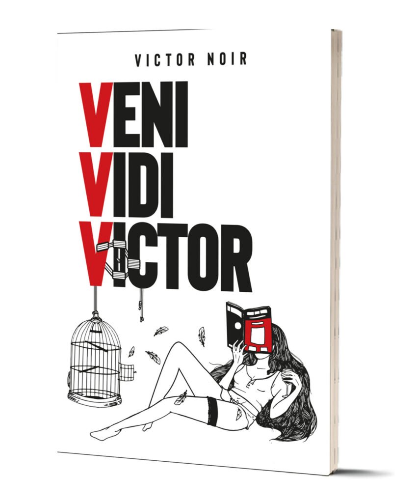
The creator of Veni Vidi Victorr had a dangerous goal: self-publishing a comedy book without it looking like a “self-published comedy book.”
The market reality is harsh: Amateur design triggers immediate skepticism. If a book looks cheap, the prospect assumes the content is cheap. The creator had no publisher and no promotional machine—just 1,000 copies printed at personal expense and a burning fear that the project would look like a chaotic, unreadable caricature.
He didn’t need a “decorator.” He needed a partner to bridge the gap between a parodic concept and a product with high perceived value.
The Diagnosis: Why “Funny” Is Hard to Sell
There was no existing “control” to beat, but the conversion bottlenecks were obvious. Transforming irony into a sellable physical asset requires extreme visual discipline.
The Direct Response Risks:
- Cognitive Overload: A comedic tone often leads to visual chaos. If the eye doesn’t know where to look, the wallet stays closed.
- The “Amateur Filter”: Without a rigorous grid, the book risks looking like a home-made pamphlet, destroying credibility instantly.
- Low Perceived Value: The “gimmick” aesthetic often kills the desire to possess the object.
A comedy book must make you laugh, but the design must command respect. It needs to look authoritative to make the parody effective.
The Protocol: Applied DRD (Direct Response Design)
We didn’t just “clean up” the layout. We engineered a reading experience designed to reduce friction and maximize the “impulse buy” factor.
1. Optical Flow Engineering: We structured the typographic path to guide the eye seamlessly through jokes and tone shifts. The reader is never lost; they are propelled forward by the layout.
2. Authority-Based Hierarchy: The cover wasn’t designed to be “playful.” It was designed with clear, commanding hierarchies readable from 10 feet away. We used rigorous white space management to frame the content as “premium,” reducing the cognitive strain on the prospect.
3. The “Invisible” Grid: We built an internal grid that creates subconscious order. These micro-details are invisible to the conscious mind but signal “Professional Quality” to the brain, justifying the price point before the book is even opened.
The Results
The market voted with their wallets. The design successfully bypassed the skepticism usually reserved for self-published works.
- Inventory: 1,000 copies printed.
- Velocity: 600+ copies sold in less than 4 days.
- Retention: Only 354 copies remained after the launch weekend.
- Feedback Loop: The author received dozens of compliments on the physical quality and aesthetics before buyers had even read the text.
The Takeaway: When a prospect praises the “look” of a book before reading it, it means the design has done its job: it removed resistance and validated the purchase decision emotionally. High readability equals high sales.
Client Feedback
“I started selling exactly 4 days ago. Out of 1,000 copies… there are currently only 354 left. It’s going very well. I’ve already received dozens of compliments on how ‘beautiful’ and aesthetically pleasing the book is—from readers who obviously haven’t had the time to read it yet.”
🚀 Is your design killing your copy?
If your sales letter, book, or VSL isn’t converting, the problem might not be the words—it might be how they are presented.
At Keryx Design, we don’t do “pretty.” We build assets that amplify your copy and maximize readability.
Leave a Reply