
When you find yourself creating a poster on the last day of the year
On December 30th, we received a message from Paola, founder of Mindfulness, now Bushori.
The situation was clear from the very first lines: a poster for an important event was needed, but no graphic designer was available and the deadline was unmanageable.
The poster had to go to print by January 2nd to meet the bureaucratic timelines for postings.
December 31st is not exactly the ideal day to start a project, yet sometimes precision is needed the most.
However, we liked the project, so we accepted the task.
The first call: turning informational chaos into a readable message
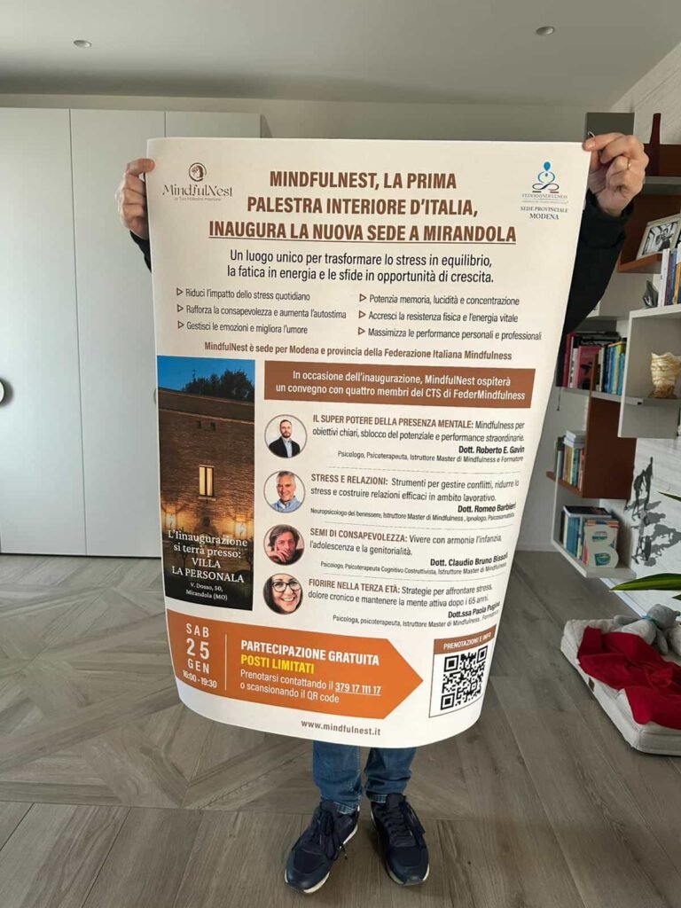
We connected online in the afternoon of December 31st.
The event had many speakers, various topics, and a rich structure.
The risk?
That a poster with all that information would become confusing, or worse, that someone would decide to “simplify” by removing useful content for decision-making.
Instead, we always start from a simple principle:
when readers must decide whether to attend an event, they want to understand what’s in it for them.
So we started from there:
- what benefits the event offers
- what activities will take place
- what expertise each speaker brings
- why someone should invest their time
Once everything was clarified, we built the visual pathway: the natural order in which the eye should read the information for understanding effortlessly.
The challenge: prioritizing, reducing doubts, deciding quickly
The most delicate point was balancing the amount of information with readability.
We organized, assigned different visual weights to the content, maintained consistency with the brand’s palette, and removed anything that generated noise.
The goal was one: to allow the person seeing the poster to answer one simple question.
“Is this an event suitable for me?”
After a couple of hours, the poster was ready.
December 31st. In the afternoon.
And with all the necessary information.
The publication: twenty likes, twelve registrations, even before official postings
Paola published the poster on Facebook the next day.
In just a few hours: twenty likes.
Normal numbers, nothing extraordinary.
Then comes the important data: twelve out of those twenty people registered for the event.
A conversion rate higher than fifty percent, achieved without even starting the official postings.
Within a week, it was sold out.
Direct comparison: “pretty” poster vs. poster that drives decisions
In event communication, it’s easy to get attracted to pure aesthetics: minimal posters, soft colors, few texts, great visual impact.
These are posters that appeal to graphic designers.
Much less to the people who must decide whether to attend.
A creative poster tends to:
- omit useful information
- emphasize shapes and colors
- make the reader dependent on a subsequent description
- leave doubts about what will happen
- force viewers to seek additional information elsewhere
A direct-response poster instead:
- immediately clarifies the purpose of the event
- connects each speaker to the benefit they provide
- anticipates the questions one might have
- reduces uncertainty
- allows for a decision in just a few seconds
It’s not always the prettiest.
But it’s almost always the one that works.
And this case proves it: when you give the reader what they need to decide, the response comes faster and stronger.
Why it really worked
The result did not come from a stroke of luck.
It came because the poster:
- spoke directly to the audience’s needs
- didn’t hide anything
- was readable even from a distance
- reduced cognitive effort
- provided a clear motivation to register
Design should never compromise clarity.
It should amplify it.
A simple rule for event organizers
When you have little time, limited space, and a lot of visual competition, readability is not a detail: it’s the most important factor.
A poster that “looks good” may be nice to look at.
A poster that immediately clarifies whether it’s worth attending… generates registrations.
If you’re preparing an event and want to check if your poster is clear, readable, and geared towards response, you can book a free 15-minute graphic check-up.
We’ll analyze it together and indicate what to improve to increase conversions.
Leave a Reply