Dear Direct Response Copywriter,
after more than 5 years in this field, having created graphics for the top players in Italian direct marketing and having trained a dozen designers to work in this field, I have realized that there are 3 indispensable elements that you need to look for in your graphic designer to make sure you are taking your conversions to the max.
The world of graphic design is a strange one: for many years the graphic design academies themselves have educated graphic designers to think along the lines of aesthetic beauty, leaving out aspects such as sales and conversion rates.
But that mindset might have proved successful until before the arrival of the Internet, or at any rate in an unsaturated market: the moment there are few competitors, it is easier to emerge.
But when making “beautiful graphics” is within everyone’s reach, the situation changes, and quite a bit, too. At that point being aesthetically beautiful is a given, while copy becomes more central than ever to the success of the campaign.
However, the more saturated the market becomes and the more complex the offerings become, the more the copy needed for persuasion becomes longer. Both in terms of the number of words and the amount of publication.
People are increasingly wary and hard to persuade. Partly because they’ve taken several burns from your competitors, partly because galloping inflation makes everyone much more conservative in choosing how to allocate their money.
I bet you are in the same situation when it comes to designers.
- You tried to hire several designers who seemed to want to sabotage your work because they were not trained in direct marketing;
- Designers who seemed more concerned about the campaign being aesthetically pleasing rather than readable, choosing unreadable fonts or giving high priority to images;
- Designers who would go so far as to question your copy and the entire campaign, trying to persuade you to follow some strange creative method studied in traditional marketing books that had nothing to do with direct marketing.
If you too have found yourself in one or more of these situations, then read all the way through today’s article because I will provide you with the 3 pillars of direct response graphics that you need to look for in your graphic designer.
And if you don’t find a chart that already has them, you can at least try to NEGOTIATE them, explaining how critical it is for you that they follow these 3 points in order to work with you.
By making these 3 points clear from the start it will be much easier to work with him and ensure that your copy comes out stronger than ever.
So I encourage you to read the next few paragraphs carefully because they will be vital in bringing as many customers as possible to read your Call To Action and offer.
1. Extreme readability
My mentor Lori Haller defines the job of direct response designer this way:
“As a designer, my only job is to make people read the copy.”
“As a designer, my only job is to make people read the copy.”
This is a fundamental teaching of the DRD, but not as popular in the world of creative graphic design , which has made eye-catching imagery its bulwark, relegating copy to a mere frill to be used creatively in turn.
This often resulted in incomprehensible and indecipherable ads more like rebuses than marketing work, where no one read a single line of text.
However, you are in the opposite situation: copy is king, not images. Which is why you need to agree with your designer from the outset on the nature of the texts you write.
Explain to him clearly that they are not decorations, but the beating heart of what you are doing and that his job is to make them extremely readable. At the cost of lowering the aesthetic beauty by a few degrees.
I’ll let you in on a secret: design, when really good, is practically invisible.
It becomes so because it is simply serving the general purpose of marketing material: to sell.
In short, the important thing is that what you have written is easy to read, practically automatically!
That means choosing a simple font but with lots of weights, so you can play with the cosmetics and make it as vivid as possible.
What are cosmetics?
I have devoted an entire book to the topic, which you can download for free from here.
2. Optical path
The second key aspect to check in your designer is whether he or she is aware of the importance of optical path and reading gravity.
Two key aspects of making reading as natural as possible that are impossible to do without in the direct marketing world.
The hierarchy of information must be extremely clear and it must be natural for the eye to navigate within the copy.
To accomplish this task, it is essential to keep the following scheme in mind:
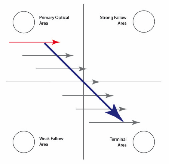
As you can see, our eye naturally starts reading from the top left and ends at the bottom right, which means these are respectively the ideal places to place headline and call to action.
But too often I have seen these elements placed in the wrong places, screwing up the copywriter’s work.
Just as I have seen too many times the designer fail to use sub headlines because they “didn’t look right,” when these are absolutely critical to giving the reader different doorways into our copy.
A deep understanding of the optical path, visual hierarchy and reading gravity are the essential basis for creating layouts that make reading as natural as possible, discarding out of hand all those creative but unreadable solutions that often appear in the advertising world.
3. Emotional Engagement
Once the readability and optical path are established, it is finally time to use colors and images. Not before as I often see it done.
It is essential to first fix the readability of the text and only then to choose images and colors to make it come alive and emotionally support the copy.
And in this regard, to make sure that the graphic designer you choose can unleash the full power of your copy, it is absolutely essential that he or she knows at least the basics:
- Proof elements;
- Benefits;
- Fears;
These are the three basic elements to highlight with images and colors when working on copy. Images in particular must best represent these elements.
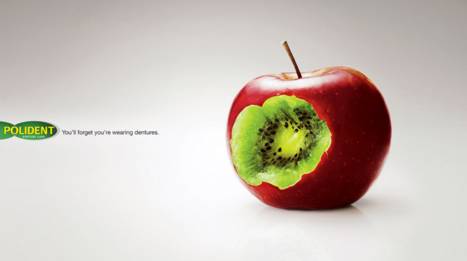
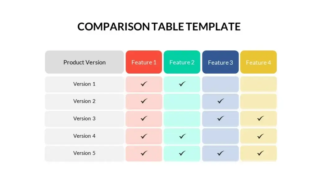
Test elements, for example, can easily become charts, statistics, comparative tables between two or more services.
Benefits are easily shown with images of happy people using the product or service.
Before/after images also prove extremely valuable for these purposes. They are also increasingly easy to make thanks to AIs that can create images tailored to our needs, bypassing the hours spent among stocks searching for the perfect image.
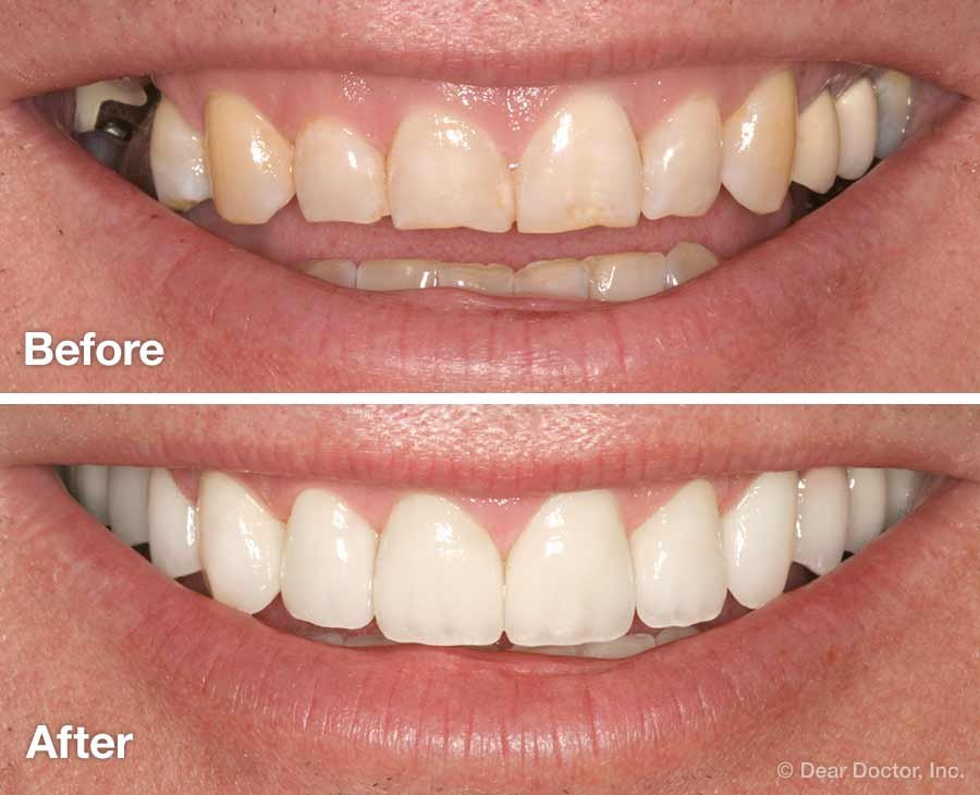
Fears, on the other hand, should be represented with caution: it is always better to represent the bright smile than the bad tooth. In general, benefits are more desirable and positive situations, in general, turn out to be much more attractive than negative ones.
My recommendation is to always have images of your product or service made by a professional photographer-they are the best long-term investment since they can be reused over and over again in different materials and different campaigns.
Regarding colors, the moment a brand is present, it is essential to follow its guidelines consistently. It is true: it will have a more “advertising” appearance, but a consistent appearance will also be proof of the seriousness of the company, especially when the customer or lead sees us for the second time.
In short, emotional engagement should not be entrusted simply to the beauty of images, but should be done while respecting the copy and its basic arguments. Each graphic element we choose must be an enhancer of the copy and not a substitute for it.
That is why it will be critical to make sure that your graphic designer understands this basic need and demonstrates a willingness to understand at least the basic mechanics of direct copy. The benefits will be evident from the first processing.
Your copy deserves a designer who will make it shine
If you’re a direct copywriter and want to focus only on what you do best-writing and selling-
now is the time to partner with a designer who specializes in Direct Response Design, and who knows the rules of readability, visual pathing, and emotional empowerment of copy.
I have created a partnership tailor-made for A-list copywriters, with clear workflow, respected timelines, and a single goal: to make your campaigns perform better.
Leave a Reply