Holiday Albania contacted us after using the same tri-fold brochure at several real-estate events.
Visually, it was well done. Clean layout, nice graphics, built like an informational brochure.
But despite looking polished, it produced zero measurable conversions. No requests, no actions, no leads.
Same disease that hits most printed marketing: it was “pretty,” but not built around Direct Response Design principles.
Holiday Albania wanted to turn that tri-fold into something that could actually collect real leads during events, and most importantly, let them know whether the material was working.
The “nice but useless” problem
The original tri-fold had a classic flaw: it went all-in on aesthetics and sacrificed readability and action.
It didn’t explain the services clearly, didn’t guide the eye, and didn’t include any measurable call to action. It was a brand-presence piece, not a sales asset.
From a DRD point of view, three core elements of direct-response marketing were missing:
-
no visual path to steer reading
-
key info buried inside the graphics
-
no clear CTA to verify performance
The worst gap was the lack of a measurable action. Without a specific goal, any printed marketing piece loses its main job: generating a response.
Adding a measurable CTA: the turning point
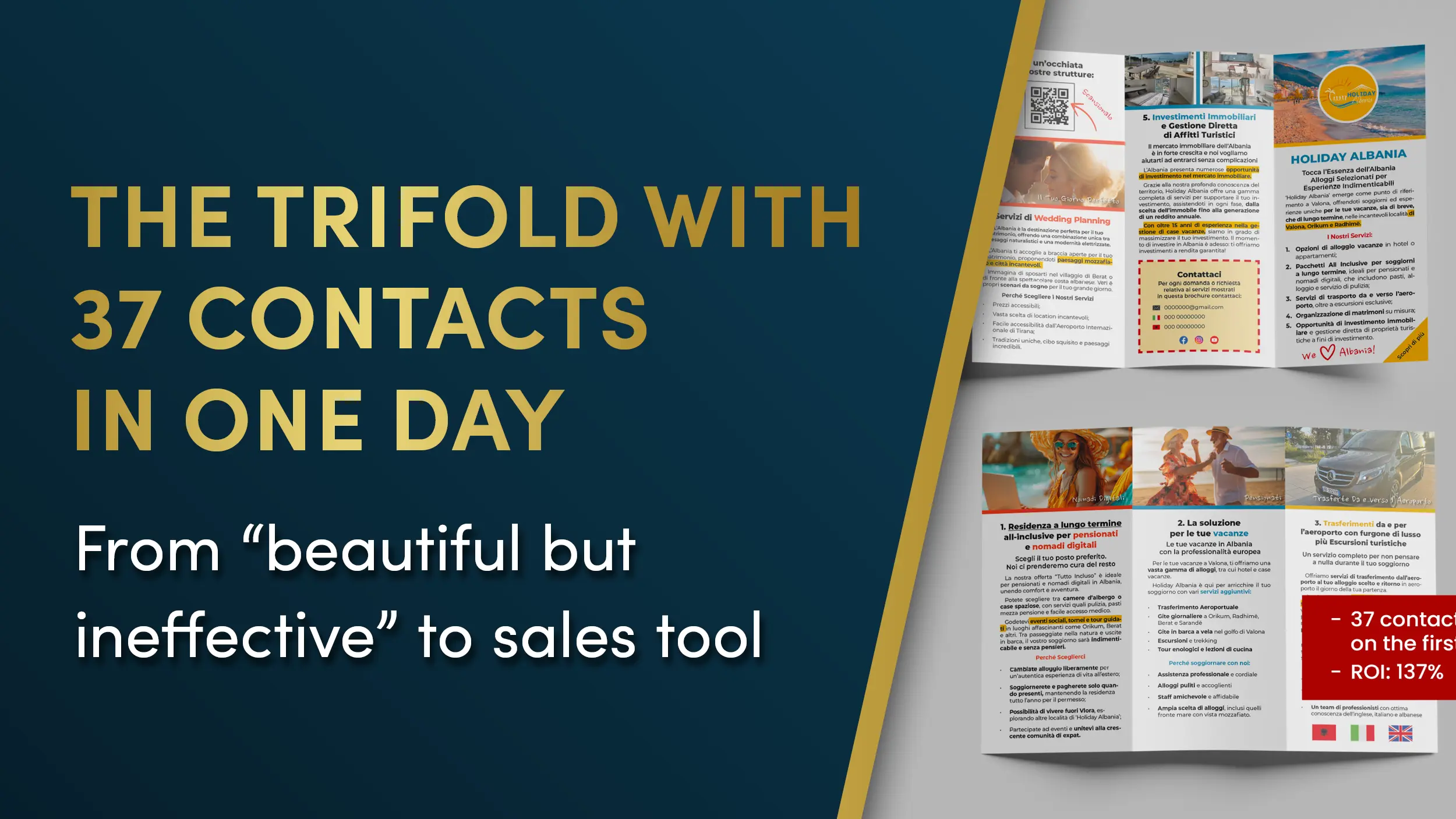
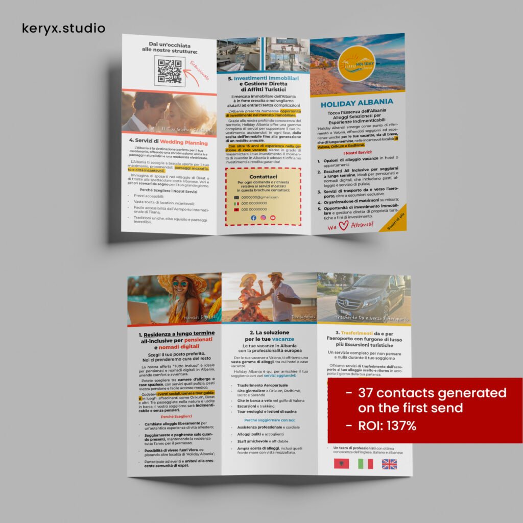
The first thing we introduced was a trackable CTA, built around a QR code leading to a dedicated page where people could download photo sheets of available properties.
A small move, but the one that turns a tri-fold from a nice brochure into a conversion tool.
The CTA was dead simple:
Scan. Browse the properties. Leave your contact.
From that moment on, every action could be tracked.
Full redesign using DRD principles
Once the next step was clear, we rebuilt the tri-fold around direct-response rules: clarity, readability, eye flow, visual hierarchy, and lower cognitive effort.
The three panels became three focused modules, one per service, with only essential info, organized and instantly understandable.
-
increased typographic readability (size, line spacing, whitespace)
-
stripped out anything that didn’t support the message
-
made the contact area impossible to miss
-
rebuilt the eye path from first opening to the CTA
-
turned the brochure into a coherent, clear, action-driven piece
Less decorative, more structured. But now it worked.
And above all, it made the message easy to read without effort.
Event day: the design does its job
At the official presentation, the redesigned tri-fold started doing what a well-built printed marketing asset is supposed to do: generate conversions.
People opened it, found the services explained clearly, spotted the CTA, scanned the QR code.
In just a few hours, Holiday Albania collected 37 real contacts, all tracked directly from the brochure.
Not luck.
Just the difference between graphic design that looks good and graphic design built to sell.
Want to fix your materials without starting from scratch?
If you’ve got a flyer, brochure, or tri-fold that “looks nice” but doesn’t bring in leads… chances are nothing needs to be reinvented. It needs to be reorganized.
That’s why the DRD Video Check-up exists.
You send me your material.
I analyze it properly.
You get a detailed video where I show you:
-
what’s killing conversions right now
-
how to boost readability and clarity
-
how to rebuild the visual path
-
how to make your CTA finally work
Leave a Reply